Table of Contents
- The Dimensions That Actually Matter
- Resolution, File Size, and Compression
- What About Shorts Thumbnails?
- Designing for Both Mobile and Desktop
- Setting Up a Template in Canva
- Setting Up a Template in Photoshop
- Setting Up a Template in Figma
- Building a Reusable Template System
- Canva vs. Photoshop vs. Figma for Thumbnail Templates
- Safe Text Areas and Cropping Behavior
- Export Settings Checklist
- Branding Consistency Across a Template Library
- Common Template Mistakes
- Frequently Asked Questions
The exact canvas setup, dimensions, and export settings for building a reusable YouTube thumbnail template in Canva, Photoshop, or Figma.
Rebuilding your thumbnail from scratch every upload wastes time you could spend on the video itself. A template solves that, but only if the canvas is set up correctly from the start. Get the dimensions wrong and you'll spend months publishing thumbnails that look soft on a phone screen or crop awkwardly in search results. This guide walks through the exact canvas setup for Canva, Photoshop, and Figma, plus the export settings that keep quality high without bloating file size.
The Dimensions That Actually Matter
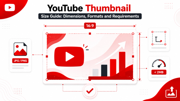
YouTube's own guidance is consistent across its Creator help documentation: thumbnails should be 1280 by 720 pixels, with a 16:9 aspect ratio, and a minimum width of 640 pixels. The accepted file formats are JPG, PNG, GIF, and BMP, and the maximum upload size is 2MB.
A few points are worth being precise about:
- 1280x720 is the recommended upload size, not a hard technical ceiling. You can upload larger source files as long as you maintain the 16:9 ratio, but 1280x720 is the size YouTube optimizes its processing pipeline around, and it's the resolution most creators should target.
- Aspect ratio matters more than exact pixel count. If your canvas isn't 16:9, YouTube will crop or pad your image to fit, which can cut off text or important visual elements you placed near the edges.
- 640 pixels wide is the minimum, but images at that size will look noticeably softer than 1280x720 once displayed at typical thumbnail sizes across devices, so treat it as a floor, not a target.
It also helps to understand why this specific size became the standard. 1280x720 sits at exactly half the pixel dimensions of a 2560x1440 display and a clean quarter of many 4K sources, which makes it simple for YouTube's systems to scale down consistently across the range of screens a thumbnail actually appears on, from a small mobile feed tile to a larger desktop suggested-videos panel. Designing at this size, or a clean multiple of it, avoids the soft, slightly distorted look that comes from working at an odd, non-standard resolution and then having it rescaled unpredictably by the platform.
Resolution, File Size, and Compression
Working at 1280x720 (or a clean multiple of it, such as 1920x1080) gives you room to add sharp text and fine detail without upscaling later. Export at 72–100 DPI for web use; DPI itself doesn't affect how YouTube displays the image, but keeping the pixel dimensions correct does.
For file format:
- JPG is the most common choice for photographic thumbnails because it compresses well without a large file size penalty.
- PNG is worth using when your thumbnail has flat color blocks, sharp text edges, or transparency in your working file, since PNG avoids the compression artifacts JPG can introduce around hard edges.
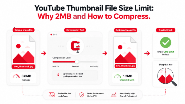
- Keep your exported file under the 2MB limit. In practice, a well-optimized 1280x720 JPG rarely approaches that ceiling unless you're exporting at maximum quality with a very complex, detail-heavy image.
What About Shorts Thumbnails?
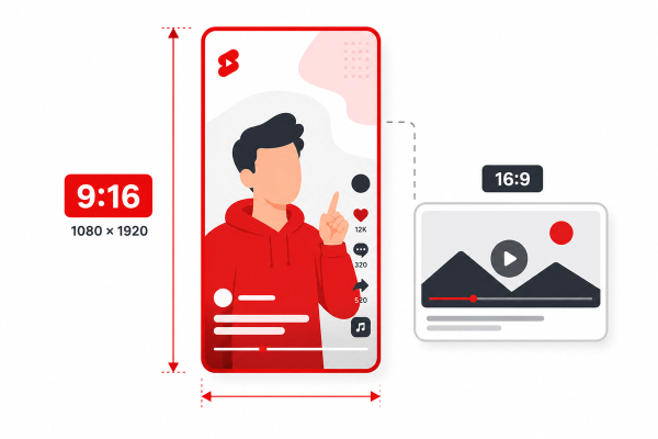
YouTube Shorts displays in a vertical, full-screen format, which is a different canvas entirely from the 16:9 landscape thumbnail this guide focuses on. If you regularly publish Shorts alongside long-form video, plan for a separate vertical template (a 9:16 canvas) rather than trying to force your landscape template into a vertical crop, since a straight crop of a horizontal design usually cuts off the subject or text awkwardly.
Designing for Both Mobile and Desktop
The majority of YouTube watch time happens on mobile devices, where thumbnails render small, sometimes at a fraction of their original size. Two practical rules follow from this:
- Keep the safe zone generous. Leave meaningful margin, roughly 5–10% of the canvas edge, free of critical text or faces, since some surfaces crop or round thumbnail corners slightly.
- Test legibility at a reduced size. Before finalizing a design, shrink your canvas preview to roughly 300–400 pixels wide, the kind of size a thumbnail actually displays at in a mobile feed, and check whether your text and main subject are still clear. If you have to squint at 100% zoom to read your own thumbnail, viewers scrolling quickly will miss it entirely.
Setting Up a Template in Canva
- Open Canva and select Create a design, then Custom size.
- Enter 1280 x 720 px and confirm the unit is set to pixels, not inches.
- Turn on guides (View > Show rulers and guides) to help align text and subject placement consistently across future thumbnails.
- Build your reusable base: background treatment, a text box with your standard font and size, and any recurring brand element like a logo or color bar.
- Group these reusable elements or save the file as a starting template you duplicate for each new thumbnail, rather than editing the original.
- When exporting, choose Download, select JPG for photographic thumbnails or PNG for graphic/text-heavy designs, and confirm the export resolution matches your 1280x720 canvas rather than a scaled-down preview size.
Canva's strength for templating is its element and text styles system: once you save consistent fonts, colors, and layout as reusable design elements, swapping them into a new thumbnail takes minutes rather than starting from a blank canvas.
Setting Up a Template in Photoshop
- Go to File > New.
- Set Width to 1280 pixels and Height to 720 pixels, with the unit set to pixels.
- Set Resolution to 72 pixels/inch (sufficient for screen display) and Color Mode to RGB, 8-bit.
- Set up guides (View > New Guide Layout) to mark your safe zone margins and a center alignment reference.
- Build your template using organized, named layers and layer groups, for example "Background," "Subject," "Text," and "Branding," so future edits don't require hunting through an unlabeled layer stack.
- Convert recurring elements, like a logo or a text treatment, into Smart Objects so you can update them once and have the change reflected if you reuse the same smart object across files.
- Save your working file as a .psd template separate from any exported thumbnail, and use File > Export As to output a JPG or PNG at the full 1280x720 canvas size for upload.
Photoshop's advantage is precision: layer groups, smart objects, and adjustment layers let you build a genuinely reusable system rather than a single flattened image you edit destructively each time.
Setting Up a Template in Figma
- Create a new Frame and set its dimensions to 1280 x 720 in the right-hand properties panel.
- Use Layout Grids (in the Frame's design panel) to add column or margin guides matching your safe zone.
- Build reusable pieces as Components, for example a text style component or a badge/logo component, so updating the master component updates every instance across your files.
- Save shared Text Styles and Color Styles in your Figma file or team library so every new thumbnail pulls from the same consistent typography and palette.
- Duplicate the frame for each new thumbnail rather than editing your master template frame directly, keeping one clean, reusable original.
- Export using the Export panel in the right-side properties, selecting JPG or PNG and confirming the export scale is set to 1x against your 1280x720 frame (a 2x export would unnecessarily double the pixel dimensions unless you specifically want a larger source file).
Figma's component and style system is particularly useful for teams, since multiple people can pull from the same shared components and stay visually consistent without manually copying settings between files.
Building a Reusable Template System
Regardless of the tool, a genuinely useful template includes:
- A typography system: one or two fonts, a defined size for primary text and a smaller size for secondary text, so every thumbnail reads consistently.
- A color system: a small, defined palette (2–4 core colors) rather than picking new colors each time, which keeps your channel visually recognizable in a crowded feed.
- Layer or component organization: named layers, grouped logically, so editing a template six months from now doesn't require re-learning your own file.
- A clear naming convention: something like `thumbnail_template_master.psd` for your source file and `2026-08-topic-name.jpg` for exports, so files stay identifiable as your library grows.
- Basic version control: keep a dated copy of your master template whenever you make a significant change, so you can roll back if a redesign doesn't perform as expected.
Canva vs. Photoshop vs. Figma for Thumbnail Templates
| Feature | Canva | Photoshop | Figma |
|---|---|---|---|
| Ease of setup | Fastest, minimal learning curve | Moderate, more manual configuration | Moderate, grid/component setup takes longer upfront |
| Reusability system | Saved elements and brand kit | Smart Objects, layer groups | Components and shared styles |
| Precision control | Good for most needs | Highest, pixel-level control | High, especially for teams |
| Best for | Solo creators, fast turnaround | Creators wanting fine control over compositing | Teams sharing one template library |
| Collaboration | Basic sharing/commenting | File-based, not built for live co-editing | Real-time multiplayer editing |
| Learning curve | Low | Higher | Moderate |
None of these tools is objectively "best" for every creator. A solo creator publishing several times a week usually gets more value from Canva's speed. A creator or small studio doing heavy compositing (blending photos, masking subjects, layered effects) benefits from Photoshop's control. A team of multiple editors maintaining brand consistency across contributors often gets the most value from Figma's shared components and live collaboration.
Safe Text Areas and Cropping Behavior
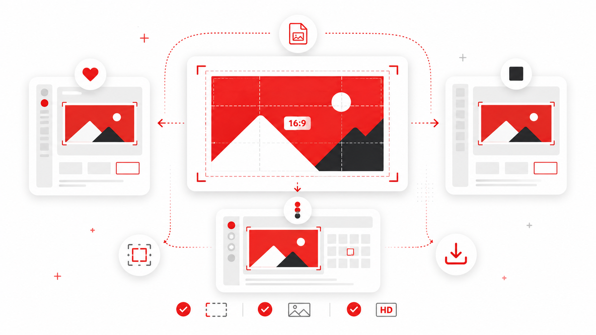
Because thumbnails display differently depending on where they appear (search results, suggested videos, mobile feed, TV app, embedded players), it helps to design with a buffer rather than placing critical elements flush against the edge.
A practical approach:
- Keep primary text and faces within the center 80–85% of the canvas.
- Avoid placing standalone letters or small icons in the outer 5–10% margin, since some display contexts apply slight rounding or cropping to thumbnail corners.
- If your design includes a border or frame element, make sure it isn't so thin that a slight crop removes it entirely, creating an uneven look compared to your other uploads.
This buffer isn't a strict YouTube requirement, it's a practical safeguard against the variability of how thumbnails get displayed across the many surfaces YouTube shows them on.
Export Settings Checklist
Before uploading a new thumbnail, run through this quick check:
- Canvas or artboard is exactly 1280x720 (or a clean 16:9 multiple like 1920x1080).
- Export format is JPG for photographic content or PNG for flat-color/text-heavy content.
- File size is comfortably under YouTube's 2MB limit.
- Exported dimensions match the canvas, not a scaled-down default preview.
- Color mode is RGB, not CMYK, since CMYK files are built for print and can shift colors unpredictably on screen.
- Text has been previewed at a reduced size to confirm mobile legibility.
- The file is named clearly, following your established naming convention, so it's easy to find again later.
Branding Consistency Across a Template Library
A template's real value shows up after dozens of uploads, not on the first one. Small, consistent choices, the same font pairing, the same accent color, the same logo placement, help returning viewers recognize your videos in a crowded suggested-videos feed before they even read the title. When updating a template, change one element at a time (for example, testing a new font) rather than overhauling the entire look at once, so you can tell whether a change actually improved click-through rate or simply looks different.
Common Template Mistakes
Designing at the wrong aspect ratio. A canvas that isn't 16:9 will get cropped or padded by YouTube, sometimes cutting off text you placed close to the edge.
Exporting at a shrunk size. Some tools default to exporting a scaled-down preview rather than the full canvas resolution. Always confirm your export dimensions match 1280x720 (or your chosen multiple) before uploading.
Overcomplicating the template. A template with a dozen movable elements is slower to use than one with three or four well-considered ones. Simplicity in the base template usually produces more consistent, faster output.
Ignoring mobile legibility during design. Designing at 100% zoom on a large monitor hides legibility problems that show up immediately once the thumbnail is viewed at typical mobile feed sizes.
Skipping file organization. Without named layers, groups, or components, even a well-designed template becomes frustrating to reuse after a few months away from the file.
Frequently Asked Questions
What is the best YouTube thumbnail size?
YouTube recommends 1280 by 720 pixels with a 16:9 aspect ratio and a minimum width of 640 pixels. Staying at or above 1280x720 gives the sharpest, most consistent results across devices.
Should I use JPG or PNG for my thumbnail?
JPG works well for photographic thumbnails and keeps file size low. PNG is a better choice for designs with flat colors, sharp text edges, or transparency, since it avoids the compression artifacts JPG can create around hard lines.
Can I upload a thumbnail larger than 1280x720?
Yes, as long as the aspect ratio stays 16:9 and the file stays under YouTube's 2MB limit. Just be aware that YouTube's own processing is optimized around the 1280x720 recommendation.
Do I need Photoshop, or is Canva enough?
Canva is genuinely sufficient for most creators, especially with its reusable element and style system. Photoshop and Figma offer more precise layer and component control, which becomes more valuable as your template library and team grow.
Why does my thumbnail look sharp on my monitor but blurry on my phone?
This is usually a design issue, not an export issue: text or detail that reads fine at full size can become illegible once shrunk to the small size thumbnails display at on mobile feeds. Always preview your design at a reduced size before finalizing it.
How do I keep my thumbnails consistent across dozens of videos?
Build a defined typography system, a small fixed color palette, and named/reusable layers or components, and duplicate your master template for every new thumbnail rather than redesigning from scratch each time.
What DPI should I export at?
72–100 DPI is standard for on-screen use. DPI doesn't affect how YouTube displays your thumbnail; what matters is that your pixel dimensions (1280x720 or a clean multiple) are correct.