Table of Contents
- Why Shorts Thumbnails Are Different
- Shorts Thumbnail Dimensions and Aspect Ratio
- How Shorts Thumbnails Display Across Devices
- Safe Areas and Cropping Zones
- Text Placement in Shorts Thumbnails
- Shorts Thumbnail Design Tips
- Setting Up Your Canvas in Canva
- Setting Up Your Canvas in Photoshop
- Shorts Thumbnails vs Long-Form Thumbnails
- Common Shorts Thumbnail Mistakes
- FAQ
YouTube Shorts thumbnails follow different rules than standard video thumbnails. This guide covers the correct 9:16 dimensions, safe zones, text placement, and design tips to make your Shorts stand out across all surfaces.
YouTube Shorts grew from a mobile-first experiment into one of YouTube's primary content formats. With that growth came a design challenge that many creators still haven't fully solved: the Shorts thumbnail is vertical—and everything you learned about designing 16:9 horizontal thumbnails doesn't fully transfer.
If you're applying a standard horizontal thumbnail to a Short, YouTube will crop it—often in ways that cut off faces, text, or key visual elements. Understanding the correct Shorts dimensions and how thumbnails display across different surfaces helps you design images that work everywhere: the Shorts feed, Home recommendations, Search results, and your channel page.
Why Shorts Thumbnails Are Different
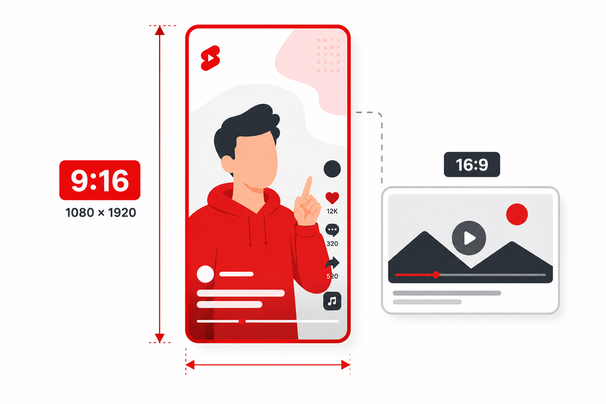
Standard YouTube videos are horizontal (16:9 ratio). Shorts are vertical (9:16 ratio). This is a fundamental design difference—the same image can't work for both without deliberate consideration.
The Shorts feed operates like TikTok or Instagram Reels—a full-screen vertical swipe experience. In that context, the thumbnail functions as both the cover image and a video frame preview. But Shorts also appear in non-feed contexts: the Home feed recommendation grid, Search results, a channel page's Shorts shelf, and cross-platform embeds. In those contexts, the thumbnail may be cropped, letterboxed, or displayed at unexpected aspect ratios.
Designing a Shorts thumbnail that works across all these surfaces requires understanding where it will be cropped and how to protect your key content in the visible areas.
Shorts Thumbnail Dimensions and Aspect Ratio
The recommended dimensions for YouTube Shorts thumbnails are 1080×1920 pixels at an aspect ratio of 9:16. This is the same resolution as a full-screen mobile video frame, which makes sense given how Shorts are filmed and displayed.
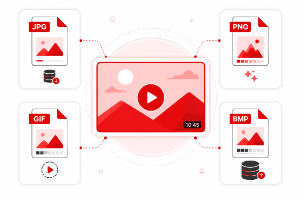
Key specifications: Resolution: 1080×1920px (recommended) or any 9:16 proportion. Minimum resolution: 480×854px (below this, thumbnail quality suffers noticeably). Aspect ratio: 9:16 (vertical). File format: JPG or PNG. Maximum file size: 2MB. Color profile: sRGB for best cross-device consistency.
Note: YouTube's thumbnail specifications can update over time. Check the Thumbix thumbnail size guide or YouTube's official Help Center for the most current file size limits and upload requirements, as platform policies evolve.
How Shorts Thumbnails Display Across Devices
Mobile (Shorts Feed)
In the Shorts feed on mobile, your thumbnail appears full-screen vertically before the Short starts autoplaying. This is the optimal display context—your 9:16 design shows completely as intended, filling the entire screen. This is where your thumbnail has the most impact and where vertical design decisions pay off.
Mobile Home Feed
When Shorts appear in YouTube's Home feed recommendation grid on mobile, they display as vertical tiles alongside horizontal videos. YouTube crops your Shorts thumbnail to show the central portion of the 9:16 image. Content near the very top and bottom edges may be cut off—this is the most common source of Shorts thumbnail design failures.
Search Results
In Search results, Shorts thumbnails often appear as vertical tiles but at a smaller scale. Text in the thumbnail needs to be especially large and positioned centrally to remain readable at this reduced display size.
Desktop
On desktop YouTube, Shorts appear in a dedicated shelf on the Home page, channel pages, and sometimes in Suggested videos. They display as vertical thumbnails, typically showing the central portion of the 9:16 image. Desktop users viewing the Shorts player see the full vertical image.
TV (YouTube on Smart TVs)
On smart TVs, Shorts may display horizontally cropped—YouTube shows the center section of the vertical image in a horizontal frame. This is the most aggressive cropping scenario. Content positioned at the sides of your thumbnail (very far left or right) can disappear entirely on TV displays.
Safe Areas and Cropping Zones
Because Shorts thumbnails get cropped differently across surfaces, the concept of 'safe areas' is critical. A safe area is the region of your thumbnail that will remain visible regardless of how YouTube crops or displays the image.
Primary safe zone (always visible): The central 60% of your thumbnail's width and the central 70% of its height. In a 1080×1920px canvas, this translates roughly to a safe zone of approximately 648px wide by 1344px tall, centered on the canvas.
Extended safe zone (visible on most but not all surfaces): The central 80% of width and 80% of height. Elements here will show on the Shorts feed and desktop Shorts player, but may be cropped on TV or in recommendation grid previews.
Additional UI overlays to account for: YouTube adds its own UI elements over Shorts thumbnails and video frames—including the channel name and subscriber count in the lower-left, the share/like/comment buttons on the right side, and the video description at the bottom. Keep critical content away from these zones.
Specifically: avoid placing important content in the bottom 20% and the right 15% of the frame—these areas are covered by YouTube's Shorts interface overlays.
Text Placement in Shorts Thumbnails
Text placement in a Shorts thumbnail requires balancing two competing needs: visibility in full-screen Shorts player view, and readability in the cropped recommendation grid view.
Best text placement: Position your primary text in the upper-center third of the thumbnail. This area is above the UI overlays (which concentrate at the bottom and right) and within the safe crop zone for grid views. Text here stays visible in both contexts.
Text sizing: Because Shorts thumbnails are tall but may be displayed narrow (in the recommendation grid), text needs to be even larger relative to the canvas than in horizontal thumbnails. Use fonts at 120–200px on a 1080×1920px canvas for primary text. Anything smaller risks being unreadable in cropped views.
Keep text concise: 3–5 words maximum. Viewers in the Shorts feed see your thumbnail for a fraction of a second before the video begins playing. The message has to register immediately.
Shorts Thumbnail Design Tips
Use a strong central subject. Because so many cropping scenarios center the image, place your main subject—usually a face or a product—dead center or slightly upper-center. This guarantees it stays visible regardless of how YouTube crops the thumbnail.
High contrast backgrounds. On mobile, Shorts thumbnails compete with hundreds of other frames in a fast-scrolling context. A bold, contrasting background color that makes your subject and text pop is more effective than a subtle or realistic background.
Use the vertical space intentionally. Unlike horizontal thumbnails where composition happens left-to-right, vertical thumbnails let you stack elements top-to-bottom. A common effective structure: text at top, main subject (face/product) in the middle, contextual element at the bottom.
Test with the frame-grab approach. YouTube Shorts often use an automatically selected frame from the video as the thumbnail, which means your video's first few frames are actually your thumbnail for many viewers. If you're filming Shorts, design the opening frame intentionally—strong composition, clear subject, good lighting—even if you later add a custom thumbnail on top.
Maintain visual consistency. If you post Shorts alongside long-form videos, your Shorts thumbnails should still feel like they belong to the same channel. Use consistent fonts, color palettes, and subject positioning to build brand recognition across both formats.
Setting Up Your Canvas in Canva
Canva has a built-in YouTube Shorts template. Open Canva and search for 'YouTube Shorts' in the template search bar. This will create a canvas at 1080×1920px automatically.
Alternatively, set a custom canvas size: Click 'Create design' and choose 'Custom size.' Enter 1080px width and 1920px height. This creates the exact 9:16 vertical canvas you need.
In Canva, you can use guides to mark your safe zones. Add horizontal guides at approximately 20% from the top and 20% from the bottom. Add vertical guides at 10% from each side. Keep important content within these guides.
Export settings: Download as PNG for highest quality or JPG at 80–90% quality for a smaller file size. Both work for YouTube thumbnail uploads. See our thumbnail format guide for a detailed comparison of JPG vs PNG for thumbnails.
Setting Up Your Canvas in Photoshop
In Photoshop: File → New. Set Width to 1080 pixels and Height to 1920 pixels. Resolution: 72 PPI (screen resolution—higher DPI has no benefit for digital display). Color Mode: RGB. Color Profile: sRGB IEC61966-2.1 for consistent cross-device color rendering.
Add guides in Photoshop using View → New Guide. Create guides at 10% (108px) and 90% (972px) horizontally to mark left/right safe zones. Create guides at 10% (192px) and 80% (1536px) vertically to mark top/bottom safe zones accounting for YouTube UI overlays.
Export: File → Export → Export As. Select JPG (quality 80–90%) or PNG. Ensure the file size stays under 2MB—at 1080×1920px, a high-quality JPG typically exports around 400–700KB, well within limits.
Shorts Thumbnails vs Long-Form Thumbnails
The structural differences between Shorts and long-form thumbnails go beyond just orientation.
| Element | Long-Form Thumbnail | Shorts Thumbnail |
|---|---|---|
| Aspect ratio | 16:9 horizontal | 9:16 vertical |
| Recommended resolution | 1280×720px | 1080×1920px |
| Text placement | Left/center, anywhere readable | Upper-center, within safe zones |
| Subject positioning | Left or center | Center or upper-center |
| UI overlay risk | Bottom bar (title/channel) | Bottom-right quadrant (likes/comments/share) |
| Cropping risk | Minimal | High—center-crop on most grid views |
| Competition in feed | Other horizontal thumbnails | Full-screen vertical video context |
Common Shorts Thumbnail Mistakes
Using a horizontal thumbnail: This is the most common mistake. Uploading a 1280×720px thumbnail to a Short will result in it being displayed with black bars or aggressively cropped. Always use a 9:16 vertical image.
Placing text at the very top or bottom: These areas are vulnerable to cropping in recommendation grids and are often covered by YouTube's UI overlays in the Shorts player. Position text in the upper-center third.
Text that's too small: Shorts thumbnails, when displayed as recommendation tiles, show at a very small size. Text that looks fine at full resolution becomes unreadable at the 200–300px tile width used in grid views.
Not using a custom thumbnail at all: Many creators let YouTube auto-select a frame from their Short. While this sometimes works, it rarely produces the optimal first impression. A custom thumbnail designed to the 9:16 specifications will almost always outperform an automatic frame grab.
Ignoring the right-side overlay zone: The like, comment, and share buttons in the Shorts player appear on the right side of the screen. Content placed in the right 15–20% of a vertical thumbnail will often be obscured in the player.
Frequently Asked Questions
What size should a YouTube Shorts thumbnail be?
The recommended YouTube Shorts thumbnail size is 1080×1920 pixels at a 9:16 aspect ratio. This matches the vertical format of Shorts content. Minimum resolution is 480×854px, but higher resolution produces better quality across devices.
Can I use a horizontal thumbnail for YouTube Shorts?
You can upload one, but it won't display well. YouTube will crop a 16:9 horizontal thumbnail to fit the 9:16 vertical Shorts format, usually showing only the center portion. This almost always cuts off important content. Always use a vertical 9:16 thumbnail for Shorts.
Where should I place text in a Shorts thumbnail?
Place primary text in the upper-center third of the thumbnail. This area is visible in both the full Shorts player and in recommendation grid crop views. Avoid the bottom 20% (UI overlays) and the right 15% (like/share/comment buttons).
Does YouTube auto-select a thumbnail for Shorts?
Yes. If you don't upload a custom thumbnail, YouTube selects a frame from your Short. You can upload a custom thumbnail in YouTube Studio after publishing. Custom thumbnails consistently outperform auto-selected frames in click-through contexts.
What aspect ratio is a YouTube Short?
YouTube Shorts use a 9:16 vertical aspect ratio—the same as a standard smartphone screen in portrait orientation. This is the inverse of the standard 16:9 horizontal video format.
How do Shorts thumbnails look on desktop?
On desktop, Shorts appear in a vertical shelf on the Home page and channel pages. The thumbnail displays as a vertical tile, showing the full 9:16 image. In the Shorts player on desktop, the thumbnail appears full-screen vertically, similar to mobile.
What file format should I use for a Shorts thumbnail?
JPG or PNG are both accepted by YouTube. JPG produces smaller file sizes (typically under 500KB at 1080×1920) and is generally recommended for photographic thumbnails. PNG is better when your thumbnail includes transparency or flat graphics. See our JPG vs PNG guide for a full comparison.
Can I use the same thumbnail for a Short and a regular video?
Not effectively. Regular videos are 16:9 horizontal; Shorts are 9:16 vertical. Using the same image for both will result in significant cropping on one format. Design separate thumbnails optimized for each format.