Table of Contents
- Why Font Choice Matters for Thumbnails
- Typography Basics for Creators
- Readability and Mobile Viewing
- Font Hierarchy in Thumbnails
- Sans-Serif vs Serif vs Display Fonts
- Best Free Fonts for YouTube Thumbnails
- Best Premium Fonts for YouTube Thumbnails
- Fonts by Niche
- Font Pairing for Thumbnails
- Working with Fonts in Canva
- Working with Fonts in Photoshop
- Text Effects: Outlines, Shadows, and Spacing
- Common Font Mistakes
- FAQ
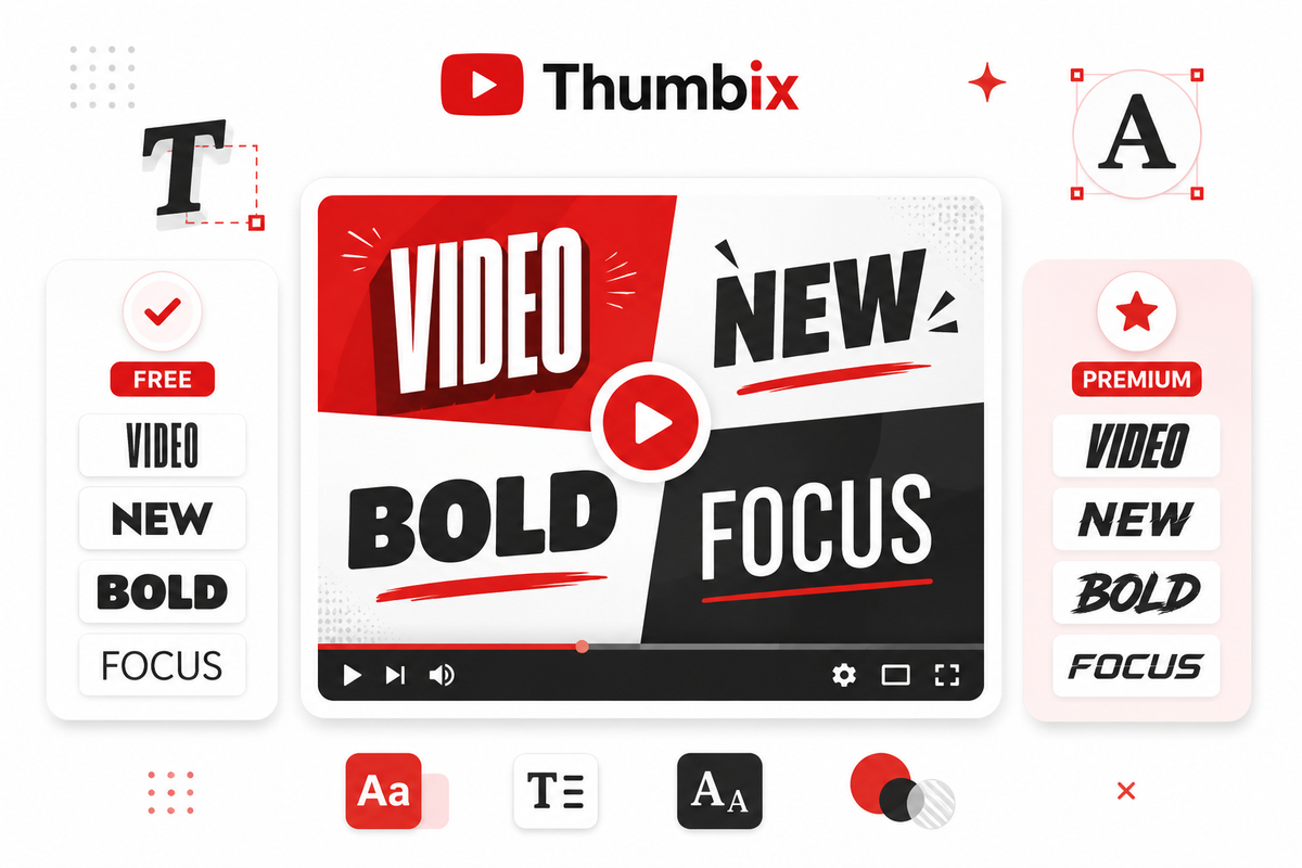
The right font can make your thumbnail text readable at 120px wide. The wrong one loses viewers before they even register what your video is about. Here are the best free and premium fonts for YouTube thumbnails.
Typography is probably the most underestimated element of thumbnail design. Creators spend hours getting the right background image, the right expression, the perfect color—and then slap a default font on top that no one can read on a phone screen.
Font choice isn't just aesthetic. It affects whether viewers can parse your text in the half-second they spend glancing at your thumbnail. It communicates tone—a condensed bold font signals energy and urgency; a clean geometric sans-serif signals authority and professionalism. Both can work, but only if they match what you're actually creating.
This guide covers the fonts that actually work—free options available on Google Fonts and tools like Canva, and premium options worth investing in for professional channels.
Why Font Choice Matters for Thumbnails
Thumbnails display at roughly 120px–168px wide on most mobile devices. At that size, thin fonts become invisible, decorative scripts become noise, and anything with fine detail dissolves into a blur. Bold, high-contrast fonts with clear letterforms are essential.
Beyond readability, font choice establishes visual identity. The most recognizable YouTube channels use consistent fonts across all thumbnails, which trains viewers to recognize their content immediately—even before reading the title. Consistency compounds over time into brand equity.
Typography Basics for Creators
You don't need a design degree to use fonts well in thumbnails, but a few fundamentals help.
Weight refers to how thick the font strokes are. Heavy and Bold weights are best for thumbnails because they're visible at small sizes. Light and Thin weights are beautiful in print but disappear on a compressed thumbnail.
Width describes whether a font is condensed (tall and narrow), normal, or wide. Condensed fonts let you fit more words in the same horizontal space, which is useful when thumbnail text needs to be punchy but slightly longer. Normal and wide fonts create more visual impact per letter.
x-height is the height of lowercase letters relative to uppercase. Fonts with high x-heights (where lowercase letters are nearly as tall as capitals) tend to read more easily at small sizes. This is one reason Montserrat reads better at thumbnail scale than fonts with very small lowercase letterforms.
Readability and Mobile Viewing
Test every thumbnail font by shrinking your design to 120px wide. If the text is still readable without squinting, it will work on mobile. If you're straining to read it at that size, your viewers aren't reading it at all—they're just seeing colored shapes.
Contrast between text and background is equally critical. White text on a light background fails. Yellow text on a white background fails. Use outlines, drop shadows, or color-blocked backgrounds behind text to ensure separation. Even the best font becomes unreadable without contrast.
Font Hierarchy in Thumbnails
Effective thumbnails usually have one primary text element and sometimes a secondary one. The primary element (the main hook or keyword) should be large, bold, and immediately visible. The secondary element (additional context or a number) should be noticeably smaller.
Avoid using three or more type sizes in one thumbnail—it creates visual noise and splits the viewer's attention. One message should dominate. If you feel you need three lines of text to explain the video, the issue is probably that the concept isn't clear enough yet, not that you need more text.
Sans-Serif vs Serif vs Display Fonts
Sans-serif fonts (no decorative strokes at letter ends) are almost always the best choice for thumbnails. They render cleanly at small sizes, have bold weights available, and feel modern. Bebas Neue, Montserrat, and Anton are all sans-serifs that dominate YouTube thumbnail design.
Serif fonts (with the decorative strokes at letter ends) can work in thumbnails for content that wants to signal tradition, authority, or high-end positioning—finance, history, documentary, or premium lifestyle content. But they require larger text size to read well at thumbnail scale.
Display fonts (highly stylized or decorative) should be used sparingly and only when they directly reinforce the channel's visual identity. A horror channel using a distressed display font makes sense. An educational channel using the same font looks unprofessional.
Best Free Fonts for YouTube Thumbnails
Anton
Anton is a single-weight condensed sans-serif with extremely thick strokes and tight spacing. It commands attention without needing much horizontal space—perfect when you need to fit a short punch line into a thumbnail. Available free on Google Fonts and built into Canva.
Strengths: Extremely bold, high visual impact, reads well at very small sizes, classic thumbnail feel. Weaknesses: Only one weight, which limits flexibility. Overused in some niches, which may reduce distinctiveness. Best use: Short, punchy text overlays—gaming, entertainment, challenge content.
Bebas Neue
Bebas Neue is arguably the most used font in YouTube thumbnails. It's all-caps, condensed, geometric, and free. Channels across gaming, finance, fitness, and education use it because it looks professional while being completely readable at small sizes.
Strengths: Clean, modern, versatile, and free. Works across virtually every niche. Weaknesses: Extremely common—you'll need to differentiate through color, spacing, or pairing choices. No lowercase variation in the free version. Best use: Primary headline text across most niches.
Montserrat
Montserrat is a geometric sans-serif with multiple weights—from Thin through ExtraBold. For thumbnails, use ExtraBold or Black weight. It looks modern and professional without the ultra-condensed feel of Bebas Neue, which makes it ideal for channels that want to feel approachable rather than aggressive.
Strengths: Multiple weights for hierarchy, clean and readable, works for both uppercase and mixed-case text. Weaknesses: Requires heavier weight (ExtraBold/Black) to punch at thumbnail size—regular weight is too thin. Best use: Education, business, lifestyle, finance channels.
Oswald
Oswald is a condensed reworking of the classic "Alternate Gothic" font style. It looks like a slightly more refined version of Impact with better spacing and multiple weights. Bold and ExtraBold Oswald works extremely well for news-style thumbnails and documentary content.
Strengths: Bold without being as blunt as Anton, good letter spacing, readable at small sizes. Weaknesses: Can feel slightly dated in entertainment niches that trend toward more modern geometric fonts. Best use: News commentary, sports, documentary, history channels.
League Spartan
League Spartan is a strong geometric sans-serif that pairs excellent readability with a modern, slightly premium feel. The Black weight creates impactful thumbnail text that doesn't feel as templated as Bebas Neue or Anton. It's a good choice for channels that want to look distinctive while staying accessible.
Strengths: Distinctive compared to overused alternatives, clean geometry, reads well at small sizes. Weaknesses: Less name recognition means fewer Canva templates use it by default. Best use: Business, tech, design, professional channels.
Poppins
Poppins is a rounded geometric sans-serif. Its approachable, friendly feel makes it ideal for educational content, lifestyle channels, and beginner-focused tutorials. At ExtraBold weight, it works well as a secondary text element rather than the primary headline in most thumbnail designs.
Strengths: Warm and approachable, excellent readability in mixed case, versatile across applications. Weaknesses: The rounded letterforms mean it has slightly less visual punch than geometric options at equivalent size. Best use: Education, wellness, lifestyle, cooking, beginner tutorials.
Barlow Condensed
Barlow Condensed is underrated in the YouTube thumbnail world. It has a slightly more humanist quality than Bebas Neue—it looks less "template" and more like intentional design. ExtraBold Barlow Condensed makes excellent thumbnail text for channels that want a distinctive look without straying from legibility.
Strengths: Less overused than Bebas, available in many weights, good range from condensed to ultra-condensed. Weaknesses: May require more kerning adjustment at large sizes. Best use: Travel, tech, fitness, music channels.
Impact
Impact is the grandfather of thumbnail fonts—it predates YouTube itself and was the font of early internet memes. It's extremely bold, condensed, and impossible to miss. Some channels still use it effectively, particularly in gaming and entertainment where its visual weight creates instant recognition.
Strengths: Maximum visual weight, universally recognized, extremely legible at small sizes. Weaknesses: Strongly associated with older internet aesthetic—can feel dated. Only one weight. Best use: Gaming, parody, reaction content where the retro feel is intentional.
Best Premium Fonts for YouTube Thumbnails
Gotham
Gotham is a premium geometric sans-serif designed by Tobias Frere-Jones. It projects authority, confidence, and professionalism. Finance channels, business educators, and creators in premium niches use it because it signals seriousness without heaviness. The Black weight for thumbnails gives excellent visual presence.
Strengths: Premium brand feel, excellent readability at all sizes, widely trusted design choice. Weaknesses: Expensive to license properly. Can feel corporate in niches that prioritize personality. Best use: Finance, business, marketing, professional services content.
Proxima Nova
Proxima Nova sits between geometric precision (like Futura) and humanist warmth (like Gill Sans). It's the font behind many well-known digital brands and feels inherently modern. For thumbnails, Proxima Nova Bold and ExtraBold read cleanly and work across a wide range of content types.
Strengths: Balanced between authoritative and approachable, excellent range of weights, highly versatile. Weaknesses: License cost. Overused in digital marketing contexts. Best use: Tech, SaaS, marketing, lifestyle, or any channel targeting a professional audience.
Avenir
Avenir is Adrian Frutiger's geometric humanist sans-serif—considered one of the finest fonts designed. Avenir Heavy and Black are excellent for thumbnail text that needs to look premium without feeling aggressive. It pairs beautifully with minimalist thumbnail design.
Strengths: Elegant and professional, distinctive letterforms, premium feel at large sizes. Weaknesses: Less impactful at very small sizes compared to condensed fonts. Not available in Canva's free tier. Best use: Design, architecture, lifestyle, travel, premium brand content.
DIN
DIN (particularly FF DIN) is a German industrial standard typeface that feels engineered and precise. It's excellent for tech, automotive, and sports content because it reads as technical and confident. DIN Bold or Condensed Bold makes assertive thumbnail text without the visual noise of more decorative options.
Futura
Futura is a geometric sans-serif with perfect circular letterforms. Futura Bold is used by some of YouTube's most design-conscious creators because it projects forward-thinking minimalism. It's less conventional as a thumbnail font—which can be a competitive advantage in crowded niches.
Fonts by Niche
Gaming Fonts
Gaming thumbnails need maximum visual energy. Top picks: Anton, Bebas Neue, Impact. These communicate urgency and action. Pair a primary font in a bright color (yellow, red, electric blue) with a bold stroke outline in black or dark color. Avoid thin or serif fonts entirely in gaming thumbnails.
Finance Fonts
Finance thumbnails benefit from fonts that signal credibility. Top picks: Gotham, Montserrat ExtraBold, Proxima Nova Bold. Keep colors conservative—white text on dark backgrounds, green as an accent. Avoid decorative or playful fonts that undermine trust.
Educational Fonts
Educational channels need fonts that feel approachable and trustworthy. Top picks: Poppins ExtraBold, Montserrat Black, League Spartan Bold. A balance between authority and warmth works best. Mixed-case text (not all-caps) often performs better in educational thumbnails because it feels less aggressive.
Entertainment Fonts
Entertainment covers broad ground—from vlogs to reaction videos to comedy. The font choice should match the specific content. High-energy reaction content: Anton, Bebas. Lifestyle and travel: Montserrat, Poppins. Comedy and personality: experiment with bolder, more expressive options.
Font Pairing for Thumbnails
Most thumbnails only need one font. If you use two, make sure they contrast clearly in weight or style—mixing two similar fonts creates confusion. Proven thumbnail font pairings:
Bebas Neue (headline) + Poppins Bold (subtext): Creates a strong primary message with a softer supporting element. Good for education and business. Oswald ExtraBold (headline) + Montserrat SemiBold (subtext): Both condensed but with different weight ratios—creates clear hierarchy. Good for news and commentary. Anton (only): Single-font approach. Maximum simplicity and visual punch. Best for entertainment.
Working with Fonts in Canva
Canva's free plan includes most Google Fonts: Anton, Bebas Neue, Montserrat, Oswald, Poppins, Barlow Condensed, and League Spartan are all available. Canva Pro adds a broader font library and lets you upload custom fonts—useful for channels that have licensed premium typefaces.
In Canva, use the Effects panel to add outlines and shadows to text. For thumbnails, a 2–4px outline in black or dark color significantly improves readability against varied backgrounds. Keep letter spacing tight for condensed fonts and add 5–10% extra tracking for fonts displayed in all-caps at large sizes.
Working with Fonts in Photoshop
Photoshop gives you more control than Canva for typography. Install fonts system-wide and they're available in Photoshop. Use Layer Styles to add stroke (outline) and drop shadow effects. For sharp rendering, set anti-aliasing to "Sharp" or "Crisp"—"Smooth" can make text look blurry at thumbnail resolution.
At 1280×720px (standard thumbnail size), font sizes of 100px–200px are typical for primary text. Preview your thumbnail at actual display size (zoom to 12–15%) to check mobile readability before exporting.
Text Effects: Outlines, Shadows, and Spacing
Outlines: A black outline of 2–5% of your font size helps text pop against any background. For white text at 150px, a 3–6px black outline typically works. Don't make the outline so thick it distorts letterforms.
Drop shadows: Use sparingly. A tight, offset drop shadow (2–3px offset, low spread) can create subtle depth. Heavy drop shadows create a dated, cluttered look.
Spacing: Condensed fonts look best with tight or normal letter-spacing. For all-caps text displayed large, adding 5–10 units of letter-spacing can improve readability. Avoid tracking text so tightly that letters overlap.
Common Font Mistakes in Thumbnails
Using thin or light font weights: these disappear at thumbnail size. Always go Heavy, Bold, ExtraBold, or Black.
Too many words: thumbnails are not summaries. Three to five words maximum. If you're writing a sentence, you're writing too much.
Mismatched font personality: a bubbly rounded font on a serious finance thumbnail signals a lack of professionalism. A harsh condensed font on a calming wellness thumbnail creates dissonance.
Low contrast: white text on a light background, or any light text on a light background, is invisible to many viewers and fails accessibility standards.
Ignoring mobile previews: design on a large monitor but always preview at mobile thumbnail size before finalizing. What looks great at 100% zoom often has readability issues at actual display scale.
Frequently Asked Questions
What is the best font for YouTube thumbnails?
There's no single best font—it depends on your niche and brand. But Bebas Neue, Anton, and Montserrat ExtraBold are consistently the most effective across the widest range of channels because they combine boldness with readability at small sizes.
What are the best free fonts for YouTube thumbnails?
All of these are free on Google Fonts and in Canva: Anton, Bebas Neue, Montserrat, Oswald, Poppins, League Spartan, and Barlow Condensed. For most creators, these options cover all needs without spending anything.
Should thumbnail text be all caps or mixed case?
All-caps text creates more visual impact at thumbnail size and is the dominant approach in gaming, entertainment, and finance. Mixed-case text feels more approachable and is better for educational or lifestyle niches. Test both with your specific font to see which reads more clearly at small sizes.
What font size should I use for thumbnail text?
When working at 1280×720px (standard thumbnail resolution), use 100–200px for primary headline text. Preview your design at actual display size (around 120–168px wide on mobile) to check readability before finalizing.
Does using the right font improve CTR?
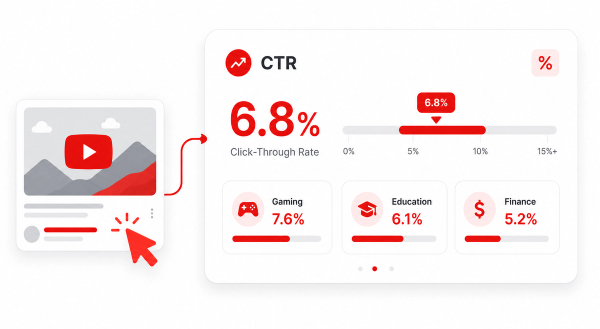
Font choice is one contributing factor to CTR, not a guarantee. A highly readable, appropriately styled font makes your text easier to process in the fraction of a second viewers spend glancing at thumbnails—which can improve clicks. But CTR depends on the overall thumbnail design, title, and topic, not any single element.
What fonts are available in Canva for free?
Canva's free plan includes most Google Fonts: Anton, Bebas Neue, Montserrat, Oswald, Poppins, Barlow Condensed, League Spartan, and hundreds more. Canva Pro adds a larger selection and lets you upload custom licensed fonts.
How do I add a font outline in Canva?
Select your text in Canva, open the Effects panel (or Style menu), and choose Outline. Adjust the thickness and color. For most thumbnails, a 2–4px black outline on white or yellow text significantly improves readability against busy backgrounds.
Are script or handwriting fonts good for thumbnails?
Generally, no. Script and handwriting fonts are difficult to read at small sizes and require significantly larger point sizes to be legible. They work occasionally as accent elements—for a creator's signature or a branded tagline—but should never be the primary thumbnail text.