Table of Contents
- Mistake 1 -- Cramming In Too Much Text
- Mistake 2 -- Weak Contrast Between Subject and Background
- Mistake 3 -- Cluttered Composition
- Mistake 4 -- Tiny or Unreadable Elements
- Mistake 5 -- No Clear Focal Point
- Mistake 6 -- Thumbnail and Title Say the Exact Same Thing
- Mistake 7 -- Misleading Clickbait
- Mistake 8 -- Copying Competitors Too Closely
- Mistake 9 -- Ignoring Mobile Viewing
- Mistake 10 -- Never Testing or Reviewing Performance
- How to Prioritize Fixes When You Spot Several at Once
- Before and After: A Quick Reference
- Why These Mistakes Often Show Up Together
- A Note on Cause and Effect
- Frequently Asked Questions
Ten specific, fixable thumbnail habits that quietly work against clicks -- with before-and-after fixes for each one.
Most low-performing thumbnails aren't the result of bad taste -- they're the result of a handful of specific, repeatable habits that quietly work against attention rather than for it. None of these mistakes will single-handedly destroy a channel, and fixing one won't guarantee a CTR spike on its own. CTR depends on context: the title, the topic, the audience, the traffic source, and how many impressions a video is actually getting. But these ten patterns show up constantly in underperforming thumbnails, and each one is genuinely worth checking.
This list comes from the same recurring issues that show up when auditing underperforming videos: a handful of structural habits that are easy to fall into and, fortunately, just as easy to test your way out of once you know what to look for. Each mistake below covers what it looks like, why creators fall into it, and what to actually try instead -- not just "do better," but a concrete next step.
Mistake 1 -- Cramming In Too Much Text
What it is: Filling the thumbnail with a full sentence, or several separate text elements competing for attention.
Why creators do it: It feels safer to "explain" the video directly on the thumbnail rather than trust the image and title to do that work together.
Why it hurts: At the small sizes thumbnails actually render -- especially on mobile -- long text blocks become an unreadable gray smear. Viewers won't stop scrolling to decode it.
What it looks like: A paragraph-length caption stacked in a small font across the top of the frame, often in a color with weak contrast against the background.
How to fix it: Cut text down to a handful of words, or none at all if the image alone tells the story. Let the title carry additional context instead of duplicating it on the image.
What to test instead: Try a version with zero text against a version with a short, three-to-five-word phrase, and compare results rather than assuming either is automatically better.
Mistake 2 -- Weak Contrast Between Subject and Background
What it is: A subject that blends into its background because colors, brightness, or tones are too similar.
Why creators do it: Thumbnails are often built directly from a raw video frame or a photo taken in whatever lighting was available, without a separate design pass.
Why it hurts: Low contrast makes a thumbnail visually flat, especially at small sizes, and it's one of the fastest ways to lose the split-second attention a scrolling viewer gives each tile.
What it looks like: A subject wearing similar tones to a cluttered or busy background, with no separation, outline, or backdrop treatment.
How to fix it: Add separation through a simplified or blurred background, a subtle outline or drop shadow around the subject, or by choosing footage or photos shot against a cleaner backdrop.
What to test instead: Compare the original frame against a version with the background simplified or the subject isolated onto a cleaner backdrop.
Mistake 3 -- Cluttered Composition
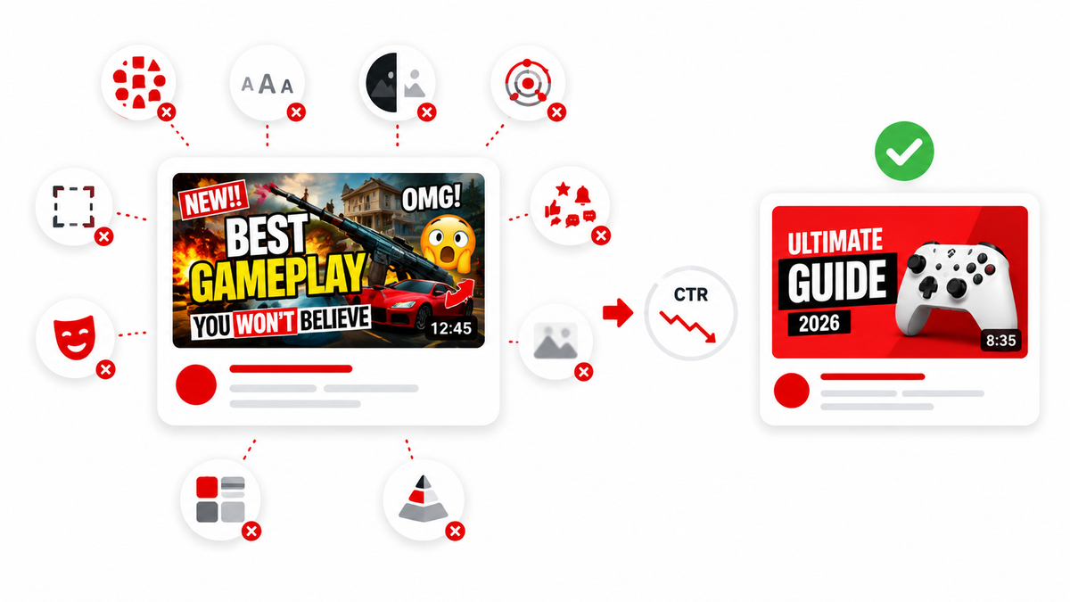
What it is: Too many competing elements -- multiple text blocks, several small images, arrows, circles, and icons all fighting for the same small space.
Why creators do it: Each individual element feels like it adds useful information, so they accumulate over successive edits without anyone stepping back to simplify.
Why it hurts: Attention has to go somewhere first. When there's no obvious "first," a viewer's eye doesn't know where to land, and the whole thumbnail reads as noise rather than a message.
What it looks like: A thumbnail with three or more separate visual elements of similar size and visual weight, none of which is clearly the focal point.
How to fix it: Pick one focal point and build everything else around supporting it. Remove any element that isn't doing real work.
What to test instead: A simplified, single-focal-point version against the original cluttered version, ideally on a video with enough impression volume to produce a meaningful result.
Mistake 4 -- Tiny or Unreadable Elements
What it is: Small details -- fine text, thin icons, subtle facial expressions -- that only read clearly at full resolution on a large screen.
Why creators do it: Thumbnails are usually designed while zoomed in on a large monitor, where every detail looks crisp and legible.
Why it hurts: Most YouTube viewing happens on mobile, where a thumbnail might display at well under two inches wide. Anything fine-grained simply disappears.
What it looks like: A design that looks polished at full size but turns muddy or illegible when shrunk to a phone-sized thumbnail preview.
How to fix it: Regularly zoom your canvas out to the actual size a thumbnail displays at -- or preview it directly in the YouTube Studio upload screen -- before finalizing.
What to test instead: A version with larger, bolder core elements against the original fine-detail version, checked specifically at mobile scale.
Mistake 5 -- No Clear Focal Point
What it is: A thumbnail where multiple elements have roughly equal visual weight, so nothing draws the eye first.
Why creators do it: It can feel more "complete" to show several relevant elements from the video rather than committing to one central idea.
Why it hurts: Viewers scroll fast. A thumbnail needs to communicate its core idea almost instantly, and that requires a clear visual hierarchy -- one dominant element, with everything else supporting it.
What it looks like: Several similarly sized objects or faces scattered across the frame with no size, position, or contrast cues indicating which one matters most.
How to fix it: Choose the single most important visual element for this specific video and make it noticeably larger, brighter, or more central than everything else.
What to test instead: A version built around one dominant focal point against the original multi-element version.
Mistake 6 -- Thumbnail and Title Say the Exact Same Thing
What it is: The thumbnail text and the video title repeat identical or near-identical information.
Why creators do it: It feels consistent and clear to reinforce the same message twice.
Why it hurts: Redundant messaging wastes an opportunity. When the thumbnail and title work together to create a small information gap, they generate more curiosity than either could alone.
What it looks like: A title reading "I Tried X For 30 Days" paired with a thumbnail displaying the exact same phrase in large text.
How to fix it: Let the thumbnail show something (an outcome, a reaction, a moment) and let the title add a different piece of information that raises a specific question.
What to test instead: A version where thumbnail and title are deliberately differentiated against the current redundant pairing.
Mistake 7 -- Misleading Clickbait
What it is: A thumbnail that implies an outcome, event, or reveal that the video doesn't actually deliver.
Why creators do it: Exaggerated thumbnails can produce a short-term CTR bump, which is tempting when chasing early performance numbers.
Why it hurts: Viewers who feel misled tend to click away quickly, which drags down average view duration and retention -- signals that matter for ongoing recommendation, not just the initial click. Repeated misleading thumbnails also erode long-term audience trust in the channel.
What it looks like: A thumbnail depicting an event, object, or emotional reaction that never actually occurs in the video.
How to fix it: Build curiosity from something the video genuinely delivers -- an honest, specific question the content actually answers.
What to test instead: An honest, curiosity-driven version against the exaggerated version, tracking retention alongside CTR, not just clicks.
Mistake 8 -- Copying Competitors Too Closely
What it is: Adopting a near-identical layout, color scheme, and text treatment to a specific competitor's thumbnails, rather than studying the underlying principles that make them effective.
Why creators do it: It's tempting to replicate a format that's visibly working for someone else in the same niche.
Why it hurts: Beyond the copyright and originality concerns of reusing someone else's specific creative work (see our guide on thumbnail fair use), a near-identical style makes your thumbnail blend into a shared feed instead of standing out from it -- and it undercuts the very differentiation that makes a thumbnail effective in the first place.
What it looks like: The same font, the same color palette, the same pose or expression style, applied across an entire channel's output because it mirrors a successful competitor.
How to fix it: Study what's working (contrast, expression, information gap) and apply those principles to an original image, rather than replicating the specific asset or exact visual formula.
What to test instead: An original design built around the same underlying principle against the near-copy version.
Mistake 9 -- Ignoring Mobile Viewing
What it is: Designing and evaluating a thumbnail only at large desktop size, never checking how it actually appears in a mobile feed.
Why creators do it: Design tools display work at large, zoomed-in sizes by default, and it's easy to forget to check the real-world rendering.
Why it hurts: Since a large share of YouTube viewing happens on phones, a thumbnail that only "works" at desktop size is effectively broken for a meaningful portion of the audience.
What it looks like: Fine text, subtle color differences, or small icons that look intentional on a monitor but vanish or blur on a phone screen.
How to fix it: Preview the thumbnail at actual mobile scale -- either through YouTube Studio's preview or by shrinking it on your own device -- before publishing.
What to test instead: Nothing to A/B test here specifically; this is a quality-control step that should happen before any version goes live.
Mistake 10 -- Never Testing or Reviewing Performance
What it is: Publishing thumbnails based purely on instinct, with no structured process for reviewing what actually performed well and applying those lessons forward.
Why creators do it: Testing takes extra time and effort that's easy to skip when there's a backlog of new videos to produce.
Why it hurts: Without a feedback loop, creators keep repeating the same effective and ineffective habits indefinitely, guessing rather than learning from their own channel's actual data.
What it looks like: A channel with no discernible pattern connecting thumbnail choices to past performance, and no use of YouTube Studio's analytics or built-in testing tools.
How to fix it: Periodically review CTR by traffic source in YouTube Studio Analytics, and use the built-in Test & Compare feature where available to test genuinely different concepts on live videos.
What to test instead: Start small -- pick your next two or three uploads and deliberately test one clear variable (focal point, text presence, or emotional tone) on each.
How to Prioritize Fixes When You Spot Several at Once
It's common to look at an underperforming thumbnail and recognize three or four of these mistakes at the same time. Rather than rebuilding everything at once -- which makes it impossible to know which change actually mattered -- it's usually more useful to prioritize based on impact and testability. Mobile readability and focal-point clarity tend to have the broadest effect and are worth fixing first as baseline quality issues, even before running any formal test. Messaging-level issues, like redundancy with the title or misleading claims, are worth addressing next since they affect trust and retention, not just the initial click. Stylistic choices, like matching a specific competitor's look too closely, are worth revisiting last, once the more fundamental issues are settled.
Before and After: A Quick Reference
| Problem | Before | Better Approach |
|---|---|---|
| Too much text | A full sentence crammed across the image | A short, bold phrase, or no text at all |
| Weak contrast | Subject blends into a similar-toned background | Clear separation between subject and background |
| Clutter | Several competing elements of equal size | One clear focal point supported by minimal extras |
| Tiny details | Fine text and small icons | Larger, bolder core elements visible at mobile size |
| Redundant messaging | Thumbnail and title repeat the same phrase | Thumbnail and title each add different information |
| Misleading claims | Implies an outcome the video doesn't deliver | Honest curiosity built from what the video actually shows |
Why These Mistakes Often Show Up Together
In practice, thumbnails rarely fail for exactly one reason. A cluttered thumbnail (Mistake 3) is often also the one with too much text (Mistake 1) and no clear focal point (Mistake 5), because all three tend to come from the same underlying habit: trying to communicate everything about a video in a single image instead of trusting the thumbnail and title to work together. When auditing an underperforming thumbnail, it's worth checking for more than one issue at a time rather than assuming a single fix will solve everything.
A Note on Cause and Effect
It's worth repeating: no single item on this list will single-handedly "kill" a video's CTR, and fixing one mistake doesn't guarantee an improvement on its own. Thumbnails compete for attention alongside titles, topic relevance, audience familiarity, and traffic source -- all at the same time. Treat this list as a set of things worth checking and testing, not a guaranteed formula.
Frequently Asked Questions
Why is my YouTube thumbnail getting no clicks?
It's rarely one single cause. Check for the common patterns above -- unclear focal point, poor mobile readability, redundant messaging with the title -- but also consider topic demand and traffic source, which affect CTR independently of the thumbnail itself.
Does more text on a thumbnail help or hurt CTR?
Generally, less is more. Short, bold, legible text can add clarity, but long text blocks usually become unreadable at small sizes and add clutter instead of communicating anything.
Is copying a competitor's thumbnail style a mistake?
Closely copying a specific competitor's layout, colors, and text treatment tends to blend your thumbnails into a crowded feed instead of standing out, and can raise originality and copyright concerns. Studying the underlying principles and applying them to an original design is generally the better approach.
How often should I test new thumbnail ideas?
There's no fixed schedule, but building a habit of testing one clear variable across your regular upload cadence, rather than testing sporadically or not at all, tends to produce more useful, applicable insights over time.
Can a great thumbnail overcome a weak title?
Not reliably. Thumbnail and title work together, and a mismatch between the two -- or genuine redundancy -- undercuts the effectiveness of both.
Should I check my thumbnails on mobile before publishing?
Yes. Since a large share of YouTube viewing happens on phones, checking real-world mobile rendering before publishing catches readability problems that aren't visible on a large desktop monitor.
Can fixing one thumbnail mistake fix a video's whole CTR problem?
Sometimes, but not reliably. These mistakes often compound, and CTR also depends on factors outside the thumbnail itself, like topic demand and traffic source. Treat fixes as things worth testing rather than guaranteed solutions.
What's the fastest mistake to check first?
Mobile readability and an unclear focal point are usually the fastest to diagnose -- shrink the thumbnail down and see whether the subject and any text are still clear within a second or two.