Table of Contents
- Rule 1: Create One Clear Focal Point
- Rule 2: Make the Main Subject Large Enough
- Rule 3: Keep Thumbnail Text Short
- Rule 4: Use Strong Contrast
- Rule 5: Choose Colors Intentionally
- Rule 6: Make Faces and Expressions Clear When Relevant
- Rule 7: Create Curiosity Without Misleading Viewers
- Rule 8: Use the Title and Thumbnail Together
- Rule 9: Design for Mobile First
- Rule 10: Remove Visual Clutter
- Rule 11: Maintain Consistent Branding
- Rule 12: Test and Improve
- Putting the 12 Rules Into a Single Checklist
- Why There's No Universal CTR Formula
Twelve practical thumbnail design rules covering focal point, contrast, text, color, and testing — without promising a specific CTR lift.
There's no formula that guarantees a specific click-through rate lift, and any guide that promises one is skipping the part where CTR depends on your audience, your topic, your competition, and dozens of other variables outside the thumbnail itself. What does hold up across niches and channel sizes is a set of design fundamentals that consistently make a thumbnail easier to understand at a glance, which is the one thing every high-performing thumbnail has in common. Here are twelve of them, explained without the inflated promises.
Rule 1: Create One Clear Focal Point
Viewers decide whether to click in a fraction of a second, which means a thumbnail needs one obvious subject the eye lands on immediately. When a design splits attention between a face, a product, a logo, and a background scene all competing for the same space, none of them register clearly. Pick the single most important element and build the rest of the composition around supporting it, not competing with it.
Rule 2: Make the Main Subject Large Enough
Most thumbnails are seen first on a phone screen at a fraction of their actual size, sometimes as small as a couple hundred pixels wide. A subject that looks appropriately sized on a full desktop monitor can shrink into an unrecognizable smudge on mobile. Design at full size, then zoom out or preview on an actual phone to confirm the main subject still reads clearly at a glance.
Rule 3: Keep Thumbnail Text Short
A thumbnail isn't a place for a full sentence. Three to five words, in large and legible type, communicate faster than a paragraph crammed into the same space — and a viewer scrolling past simply won't stop to read more than that. If you find yourself needing several lines of text to explain the video, that's usually a sign the thumbnail concept needs to change rather than the font size shrinking further.
Rule 4: Use Strong Contrast
Separation between your subject and the background, and between your text and whatever sits behind it, is what keeps a thumbnail readable at small sizes and in a crowded feed full of competing colors. A light subject against a light background, or text without an outline or shadow to lift it off a busy photo, tends to disappear the moment the thumbnail shrinks down.
Rule 5: Choose Colors Intentionally
Color affects how a thumbnail stands out against the rest of the feed and how it reads against your own channel's visual identity, but there's no single color that reliably boosts CTR across every audience and topic — that claim shows up constantly in thumbnail advice and doesn't hold up once you account for how differently viewers respond by niche. What does help is picking colors deliberately: ones that separate your subject from the background, and ones consistent enough that returning viewers start to recognize your channel by sight.
Rule 6: Make Faces and Expressions Clear When Relevant
A clear, expressive face can help a thumbnail communicate emotion and stakes quickly, which is part of why so many thumbnails include one — but faces aren't a universal requirement, and plenty of high-performing thumbnails in tutorial, gaming, or product-review niches skip them entirely because the subject matter doesn't call for it. Include a face when it genuinely supports the video's story, not as a default reflex because "faces work."
Rule 7: Create Curiosity Without Misleading Viewers
There's a real difference between a thumbnail that raises a genuine question the video answers, and one that implies something the video doesn't actually deliver. The first builds trust and repeat viewership; the second drives short-term clicks that YouTube's own watch-time-weighted systems, including A/B testing, are increasingly built to filter out. Curiosity should point toward the real content, not away from it.
Rule 8: Use the Title and Thumbnail Together
A thumbnail and title that repeat the exact same information waste half of the available space to communicate the video's premise. Treat them as two parts of one pitch: let the thumbnail carry the visual hook and let the title carry context, specifics, or a detail the image can't show, so together they say more than either could alone.
Rule 9: Design for Mobile First
The majority of YouTube viewing happens on phones, so a thumbnail that only looks good at full desktop size is designed for the wrong audience. Build the composition assuming it'll be viewed small first, and treat the larger desktop and TV placements as a bonus rather than the baseline.
Rule 10: Remove Visual Clutter
Extra props, busy backgrounds, unnecessary text, and secondary graphics all pull attention away from the one focal point a thumbnail needs. If an element doesn't directly support the main subject or the core idea of the video, it's usually worth cutting rather than shrinking down to make room.
Rule 11: Maintain Consistent Branding
A recognizable font, a consistent color palette, and a repeated visual style across your uploads help returning viewers spot your content in a crowded feed without having to read the title first. That consistency compounds over time — a single well-designed thumbnail helps one video, but a consistent style helps every video you publish going forward.
Rule 12: Test and Improve
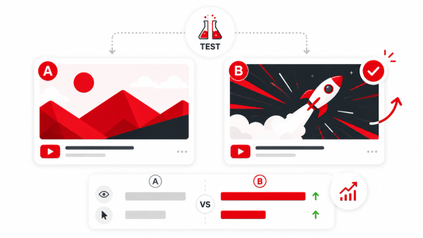
Opinions about what makes a good thumbnail, including the eleven rules above, are a starting point, not a final answer for your specific audience. YouTube Studio's built-in A/B testing feature lets you validate design choices against real viewer behavior instead of guesswork, and our CTR Goal Calculator can help you see how a realistic CTR improvement translates into actual additional views for your channel.
Putting the 12 Rules Into a Single Checklist
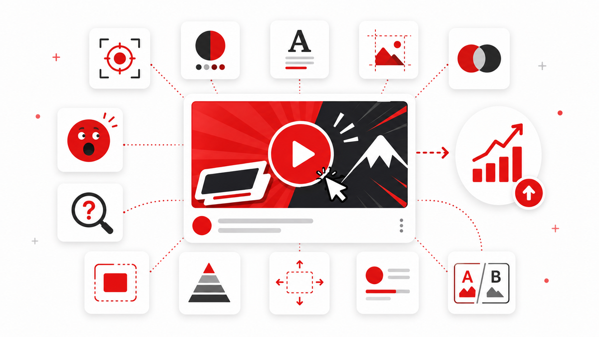
When you're reviewing a draft thumbnail before publishing, it helps to run through the rules as quick questions rather than trying to hold all twelve in your head as abstract advice: Is there one clear subject? Will it still read at mobile size? Is the text short enough to register in a glance? Is there enough contrast between the subject, the text, and the background? Are the colors intentional rather than accidental? Does a face, if present, actually serve the video's story? Does the concept build genuine curiosity rather than a false promise? Do the thumbnail and title add up to more than either alone? Is anything unnecessary cluttering the frame? Does it match your channel's established look? None of these questions requires design software to answer — just a fresh look at the draft before it goes live.
Why There's No Universal CTR Formula
Click-through rate is shaped by far more than the thumbnail alone: your audience's habits, the traffic source (search versus suggested versus home feed all behave differently), how competitive your topic is, how well the title matches viewer intent, your channel's size and existing subscriber trust, whether the viewer is new or returning, the device they're on, and the surrounding thumbnails they're comparing yours against in that moment. A thumbnail is one part of that decision, an important one, but never the whole equation — which is exactly why testing against your own data matters more than following any single rule in isolation.
Frequently Asked Questions
How much text is too much on a thumbnail?
As a general guideline, three to five words in large type is about the limit for something a scrolling viewer will actually register; longer phrases tend to go unread.
Do faces really increase click-through rate?
Faces can help when the video's content is genuinely about emotion, reaction, or a person, but there's no universal rule that adding a face always improves CTR — plenty of high-performing thumbnails skip faces entirely depending on the topic.
What are the best colors for YouTube thumbnails?
There's no single best color across all niches and audiences. What matters more is choosing colors that create contrast with your subject and stay consistent enough for viewers to recognize your channel.
How often should I redesign my thumbnail template?
There's no fixed schedule — it's worth revisiting your approach when performance data (including A/B test results) suggests a specific element consistently underperforms, rather than changing style for its own sake.
Does thumbnail file size or dimensions affect CTR?
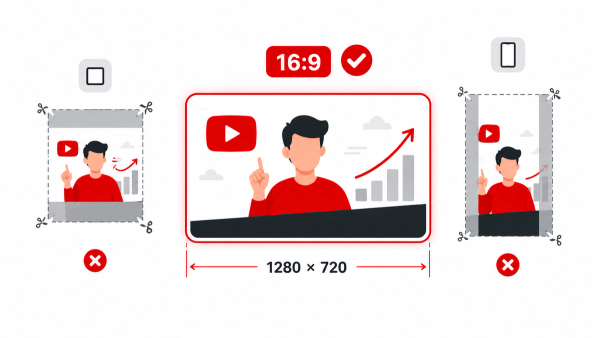
Not directly. Getting the technical specs right (correct 16:9 shape, under the file size limit) just ensures the thumbnail displays properly; the actual click decision comes down to the design choices covered in this guide.
Is clickbait ever acceptable?
Creating genuine curiosity about content the video actually delivers is different from implying something false. The second approach tends to hurt watch time and long-term trust, both of which factor into how YouTube's own systems, including A/B testing, evaluate a thumbnail.
Should I try to apply all 12 rules to every thumbnail at once?
Not necessarily all at once from scratch. Many creators find it more useful to test one variable at a time using A/B testing, so they can tell which specific change actually moved the needle.
Should my thumbnail and title say the exact same thing?
It's usually more effective for them to complement each other rather than repeat identical information, since that wastes the chance to communicate more about the video in the limited space both have.