
Table of Contents
- What Thumbnail Composition Actually Means
- Visual Hierarchy: What Viewers See First
- The Focal Point
- The Rule of Thirds Explained
- Applying the Rule of Thirds to Thumbnails
- When to Break the Rule of Thirds
- Contrast, Depth, and Subject Isolation
- Text Placement in Thumbnail Composition
- Composition for Mobile Viewers
- Common Thumbnail Composition Mistakes
- Practical Composition Workflow
- Thumbnail Composition Checklist
- Frequently Asked Questions
Good thumbnail composition isn't about following rules — it's about making viewers see the right thing instantly. Here's how to do that with intention.
A viewer decides whether to click your thumbnail in a fraction of a second. That decision happens faster than conscious thought — it's a visual reflex, triggered by where their eye lands first and whether what they see there makes them want to know more. Thumbnail composition is the practice of designing that visual experience intentionally.
Most creators learn about composition through the rule of thirds — and it's a genuinely useful framework. But composition is broader than any single rule. It's about understanding how the human eye moves through an image, what draws attention first, and how to arrange every element in your thumbnail so that the most important thing is seen most clearly and most quickly.
This guide walks through the core principles of thumbnail composition — including the rule of thirds, visual hierarchy, focal points, contrast, text placement, and mobile viewing — with a practical workflow you can apply to every thumbnail you design.
What Thumbnail Composition Actually Means
Composition refers to how visual elements are arranged within a frame. In photography and traditional art, composition is studied as a discipline with its own principles, rules, and deliberate departures from those rules. For YouTube thumbnail design, the goal of composition is more specific: to guide the viewer's eye toward the right element, in the right order, quickly enough to earn a click.
A well-composed thumbnail is not necessarily the most beautiful one. It's the one that communicates its message most clearly and most compellingly at the size and speed at which viewers encounter it. That means composition decisions are always in service of one question: does this arrangement make it obvious and compelling why someone should click?
The elements you're composing in a thumbnail might include a face or person, a product or object, background imagery, text, icons, or graphic overlays. Every single one of these elements either helps or hinders the viewer's ability to understand the thumbnail instantly. Good composition is largely about deciding what to include, what to exclude, and what to prioritize.
Visual Hierarchy: What Viewers See First
Visual hierarchy is the order in which a viewer perceives elements in an image. Your eye doesn't take in an entire image simultaneously — it moves through a frame, landing on the most visually dominant element first, then working through the other elements in descending order of visual weight.
Several factors control visual dominance:
- Size — larger elements are seen before smaller ones.
- Contrast — elements with high contrast against their surroundings attract attention first.
- Color saturation — bright, saturated colors draw the eye before muted or desaturated tones.
- Position — elements in the upper-left area of an image are often noticed slightly earlier, following natural reading patterns.
- Faces — human faces, particularly eyes, are processed preferentially by the visual cortex.
- Isolation — an element surrounded by open space draws attention more readily than one embedded in visual clutter.
When designing a thumbnail, you're essentially engineering a visual hierarchy. The most important element should have the highest visual dominance. Secondary elements should have lower visual weight. Everything else should be stripped out or reduced so it doesn't compete.
The Focal Point
Every effective thumbnail has a single primary focal point — the one element that the viewer's eye is drawn to first and that carries the main message of the thumbnail. This might be a face, a product, a striking image, bold text, or a visual result. But there should be only one dominant focal point.
When a thumbnail has multiple elements competing for visual dominance, the viewer's eye doesn't know where to land. The result is visual confusion — the viewer reads the thumbnail as busy or unclear, and that split-second confusion is enough to move on without clicking. A thumbnail that communicates one thing clearly will almost always outperform a thumbnail that tries to communicate three things simultaneously.
Choosing your focal point before you begin designing is the single most important compositional decision you'll make. Ask: if this thumbnail could only show one thing, what would that one thing be? The answer is your focal point, and every other element in the frame should serve it.
The Rule of Thirds Explained
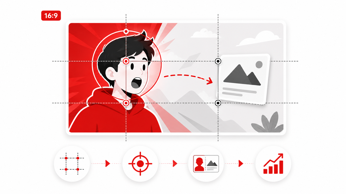
The rule of thirds is a compositional guideline that divides the frame into nine equal sections using two horizontal lines and two vertical lines. This creates a 3x3 grid. The four points where those lines intersect are called "power points" or "points of interest" — and they are positions where the human eye tends to rest naturally when viewing an image.
The principle behind the rule of thirds is that placing your main subject at or near one of these intersection points tends to feel more visually balanced and engaging than centering the subject. A centered composition can feel static and symmetrical — sometimes intentionally so, and sometimes in a way that feels flat.
In practical thumbnail terms: if you're placing a face in your thumbnail, positioning the eyes at or near the upper intersection points of a rule-of-thirds grid often creates a more dynamic, engaging composition than placing the face dead-center. If you're placing a product, positioning it at one of the left or right vertical lines creates a sense of visual tension and movement that a centered product lacks.
Applying the Rule of Thirds to Thumbnails
Faces and Portraits
When using a face in a thumbnail, position the eyes approximately along the upper horizontal third of the frame. This is a convention borrowed from portrait photography and it works well in thumbnails because it naturally places the most emotionally readable part of the face — the eyes and expression — in a visually prominent position while leaving space for other elements below or to one side.
Products and Objects
For product or object thumbnails, positioning the subject along one of the vertical lines — left or right — creates visual balance while leaving space on the other side for text or supporting elements. This is particularly useful for review thumbnails, where you want the product prominent and readable text beside it.
Text and Graphics
Text in thumbnails often works best when it occupies a clearly defined zone — either the left third, the right third, or the lower third — rather than overlapping with the main subject. This prevents the text from competing with the image for visual priority and makes both elements easier to read.
When to Break the Rule of Thirds
The rule of thirds is a useful guideline — not a mandatory rule. There are specific situations where deliberately breaking it produces a stronger composition.
Centered Compositions for Symmetry and Emphasis
When the subject is inherently symmetrical — a face looking directly at the camera, a symmetrically framed product, a graphic design element — centering it can create a commanding visual presence. Centering says: "look at this. Only this." Used deliberately, it communicates authority and directness. A centered face making direct eye contact with the viewer is one of the most attention-commanding thumbnail compositions in the platform's visual vocabulary.
Full-Bleed Subjects
Sometimes a subject that fills the entire frame — breaking every conventional compositional rule — is the most striking option. A tightly cropped face with maximum emotional expression, filling edge-to-edge, can create an immediacy and intensity that a rule-of-thirds composition can't match. This approach works when the subject itself is so compelling that it doesn't need compositional framing — it just needs visibility.
The key principle is this: break the rule of thirds when you have a specific reason to, not by accident. Unconventional compositions that communicate clearly and with visual force are effective. Unconventional compositions that simply result from not thinking about placement are just confusing.
Contrast, Depth, and Subject Isolation
Contrast
Contrast is one of the most powerful tools in thumbnail composition. A subject that contrasts strongly with its background is immediately separated visually from everything around it. This can be achieved through value contrast (light subject on dark background or vice versa), color contrast (a warm-toned subject on a cool-toned background), or saturation contrast (a vivid subject on a desaturated background).
Strong contrast also makes thumbnails readable across different screen conditions — mobile screens in bright sunlight, older devices with less vibrant displays, and the wide variety of screen sizes and brightness settings your audience uses. A low-contrast thumbnail that looks beautiful on a calibrated desktop monitor may be nearly invisible on a phone screen outdoors.
Creating Depth
Depth in a thumbnail composition is the visual sense that the image has layers — a foreground, a midground, and a background. Depth makes a thumbnail feel three-dimensional rather than flat, and three-dimensional images tend to read as higher quality and more polished.
Depth can be created by blurring the background (simulating shallow depth of field), by using overlapping elements (placing the subject partially in front of background elements), by using scale variation (larger objects in the foreground, smaller in the background), or by using directional lighting that separates foreground from background.
Subject Isolation
Isolation means giving your primary subject enough visual breathing room that it stands apart from everything else in the frame. Negative space — empty space around the subject — is not wasted space. It's the compositional tool that directs attention. A subject surrounded by visual noise competes for attention; a subject surrounded by negative space commands it.
Text Placement in Thumbnail Composition
Text in thumbnails is a compositional element, not just an information delivery method. Where you place text, how large it is, and how it contrasts with the background are all composition decisions with direct impact on readability and visual balance.
The most common mistake with thumbnail text is using it to repeat information already communicated by the image. If your thumbnail shows a clear visual of a finished recipe, adding the word "RECIPE" doesn't add value — it adds clutter. Text earns its place in a thumbnail when it provides information the image cannot: a specific number, a qualifier, a twist, or a context that makes the image more meaningful.
Practical text composition guidelines for thumbnails: keep the character count very low (3–6 words at most), use large enough type that text is readable at small thumbnail sizes, place text in an area where it doesn't overlap with the focal point, and use a strong text-background contrast (typically a dark stroke or shadow on lighter backgrounds, or vice versa). See our guide to YouTube thumbnail fonts for specific typeface recommendations that hold up at small sizes.
Composition for Mobile Viewers
Most YouTube viewing happens on mobile devices, and thumbnails on mobile screens appear significantly smaller than on desktop. Compositional decisions that look fine at large preview sizes can fall apart at mobile thumbnail dimensions — typically around 210x118 pixels in the feed.
The practical implications for composition: reduce the number of elements in the frame, ensure that fine details don't carry the communicative weight of the thumbnail (since those details will vanish at small sizes), make sure the focal point reads clearly at 200px wide, and check that any text included is large enough to remain legible without zooming.
A good practice before finalizing any thumbnail: reduce the size of your preview image to roughly 210x118 pixels and evaluate it at that size. What can you still read? What has become unclear? If the focal point is no longer obvious at that size, the composition needs simplifying. Thumbix's thumbnail preview tool makes this step easy — you can see your thumbnail at actual display sizes before committing.
Common Thumbnail Composition Mistakes
Most composition problems fall into a small set of recurring mistakes:
- Too many elements competing for attention — when everything is prominent, nothing is prominent.
- Too much text — long phrases or full sentences become unreadable at thumbnail size and clutter the visual field.
- Low contrast — a subject that blends into the background becomes invisible, especially on mobile or in different lighting conditions.
- Face too small — if you're using a face thumbnail, the expression needs to be readable. A small face in the corner communicates nothing.
- No clear focal point — when the composition doesn't establish a visual hierarchy, viewers don't know where to look and the thumbnail feels unclear.
- Busy backgrounds — a complex background image behind the main subject makes the subject harder to isolate and read.
- Text overlapping the focal point — placing text on top of the subject's face or over the main subject element creates visual competition that reduces the impact of both.
Practical Composition Workflow
Here is a step-by-step workflow for composing effective thumbnails. Apply this process to every thumbnail you design, not just the ones you're unsure about.
- Identify the Main Message — Before opening any design tool, decide what the thumbnail needs to communicate. One sentence. "This video shows how to do X" or "This video reveals Y." That's what your composition needs to convey.
- Choose the Focal Point — What single visual element communicates that message most clearly? A face, a product, a result, a graphic? That element is your focal point. Everything else is secondary.
- Position the Main Subject — Place the focal point intentionally. Consider the rule-of-thirds intersection points as natural starting positions, but allow the visual logic of the specific subject to override it if centering or an unusual crop serves the image better.
- Establish Visual Hierarchy — Ensure the focal point is the most visually dominant element. Reduce or remove anything that competes with it. If two elements seem equally prominent, decide which one is actually primary and reduce the other's visual weight.
- Add Supporting Elements — Once the focal point is established, add any secondary elements (text, icons, background details) that genuinely support the message. Position them so they complement rather than compete.
- Add Text Only If Necessary — Ask whether the image communicates the message without text. If it does, the text may not be necessary. If the text genuinely adds context the image can't convey, add it — but keep it minimal and ensure it has strong contrast and a clear position within the frame.
- Check at Small Size — Reduce the thumbnail to approximately 210x118 pixels (or view it in Thumbix's thumbnail preview) and evaluate it. Is the focal point still clear? Is the text still legible? Is the emotional message still readable?
- Remove Anything That Competes With the Focal Point — Do one final pass and ask whether each element earns its place. Anything that creates visual noise without contributing to the main message should be removed.
Thumbnail Composition Checklist
- Is there a single, clear focal point?
- Is the focal point visually dominant over all other elements?
- Is the subject positioned intentionally (rule of thirds, centered, or another deliberate approach)?
- Is there strong contrast between the subject and background?
- Is the background free from visual clutter that competes with the subject?
- If text is present, is it readable at small thumbnail sizes?
- Is the text positioned so it doesn't overlap the focal point?
- Have you checked the thumbnail at approximately 210px wide (mobile size)?
- Is every element in the frame earning its place, or is something adding visual noise without adding meaning?
Good thumbnail composition is learnable. Like any visual skill, it develops through deliberate practice — studying what works in your niche, applying principles consistently, and developing your eye for what feels clear versus cluttered. The rule of thirds is a useful starting framework, but the real goal is simply this: the right viewer should see your thumbnail, instantly understand the value of the video, and click.
Before designing your next thumbnail, spend a few minutes looking at the top-ranking videos in your target search query. Download their thumbnails with Thumbix and study their composition — where the focal point sits, how much text they use, how they handle contrast and background separation. Competitive thumbnail research is one of the fastest ways to develop compositional instincts for your specific niche.
Frequently Asked Questions
What is thumbnail composition?
Thumbnail composition is the deliberate arrangement of visual elements within a thumbnail frame — subject placement, text positioning, use of contrast and negative space — to guide the viewer's eye to the most important element as quickly and clearly as possible.
Should every YouTube thumbnail follow the rule of thirds?
No. The rule of thirds is a useful starting guideline, not a mandatory rule. Centered compositions, full-bleed subjects, and other unconventional approaches can be more effective in specific situations. The goal is to communicate clearly — use the rule of thirds when it serves that goal, and break it deliberately when something else works better.
How many elements should a YouTube thumbnail have?
As few as possible. Most effective thumbnails have one clear focal point and one or two supporting elements at most. The fewer elements competing for attention, the more clearly the main subject communicates. When in doubt, remove rather than add.
Where should text be placed in a YouTube thumbnail?
Text should occupy a clearly defined zone separate from the focal point — typically the left third, right third, or lower portion of the frame. It should not overlap with the main subject. Text also needs to be large enough to remain legible at mobile thumbnail sizes (roughly 210px wide).
How do I create a focal point in a YouTube thumbnail?
Make the focal point the largest, most contrasting, or most visually dominant element in the frame. Isolate it with negative space, use a blurred or simplified background, and reduce the visual weight of everything else in the composition.
What is the most common thumbnail composition mistake?
Too many competing elements. When multiple elements in a thumbnail have equal visual weight, the viewer's eye doesn't know where to land. This creates visual confusion and reduces the likelihood of a click. Simplify until one element is clearly dominant.
Does thumbnail composition affect click-through rate?
Yes. A well-composed thumbnail communicates its message faster and more clearly, which increases the likelihood of a click from viewers who are a good match for the content. Poor composition creates visual noise that can cause viewers to scroll past without fully processing what the video is about.
How do I check my thumbnail composition for mobile viewers?
Reduce your thumbnail preview to approximately 210x118 pixels and evaluate it at that size. The focal point should still be immediately clear, text should still be legible, and the overall message should be readable without zooming in. Tools like Thumbix's thumbnail preview function let you check this before publishing.