
Table of Contents
- Why Color Matters More Than You Might Think
- The Real Driver: Contrast, Not Color Choice
- How Saturation and Brightness Affect Visibility
- Warm Colors: Red, Orange, Yellow
- Cool Colors: Green, Blue, Purple
- Neutral Colors: Black, White, and Grays
- Color Combinations That Work — and Why
- Competing Thumbnails and the Surrounding Color Context
- Brand Consistency vs. Standout Visibility
- Accessibility and Color Blindness Considerations
- A Practical Color Selection Framework
- How to Test Your Color Choices
- Frequently Asked Questions
No single color guarantees more clicks — but contrast, saturation, and color relationships absolutely shape whether your thumbnail stands out or disappears.
YouTube thumbnail color advice is everywhere — and a lot of it is oversimplified to the point of being misleading. "Use red because it grabs attention." "Yellow is the most visible color." "Blue builds trust." These are generalizations that contain a grain of truth but ignore most of the context that determines whether a color choice actually helps or hurts a specific thumbnail.
The reality is more useful and more nuanced: color is a tool, and like any tool, its effectiveness depends on how and where you use it. The same red that makes a gaming thumbnail pop can make a financial advice thumbnail look amateurish. The same clean blue palette that signals professionalism in a technology channel might disappear completely in a feed dominated by other tech channels using the same blue palette.
This guide cuts through the generic advice and gives you a practical understanding of how color actually affects thumbnail visibility and click-through rate — along with a framework for choosing colors that work specifically for your channel and niche.
Why Color Matters More Than You Might Think
Color is the first thing the human eye processes when it encounters a visual. Before you read text, before you identify a face or a product, your visual system has already responded to the color composition of an image. In a YouTube feed where dozens of thumbnails are competing for a viewer's attention simultaneously, color is the layer of perception that operates before conscious choice.
This doesn't mean brighter is always better, or louder colors always win. It means color plays a significant role in whether a thumbnail gets noticed at all before the viewer makes a conscious decision about whether to click. A thumbnail that doesn't register in the visual periphery is never even evaluated — the viewer's eye passes over it before the conscious mind engages.
Color also carries emotional associations — both universal ones (bright warm colors tend to feel energetic; muted cool tones tend to feel calm and serious) and cultural ones (associations with specific colors vary significantly across different audiences and regions). When color choices align with the emotional tone your audience expects, the thumbnail feels right and trustworthy. When they clash, the thumbnail creates a subtle cognitive dissonance that viewers may not consciously identify but often respond to negatively.
The Real Driver: Contrast, Not Color Choice
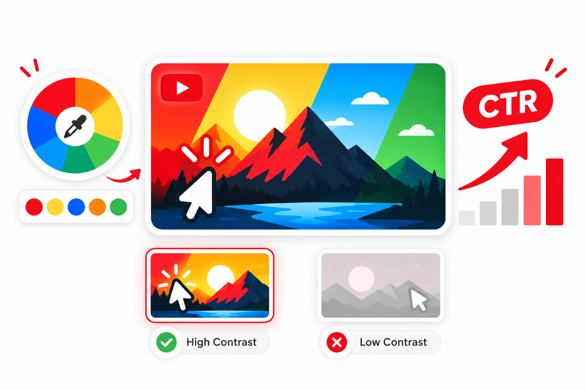
If there's one principle that matters more than any specific color choice, it's contrast. Contrast is what makes a thumbnail legible — it's the visual separation between your subject and the background, between your text and the surface it sits on, and between your thumbnail and the surrounding thumbnails in the feed.
A thumbnail using "ordinary" colors but with strong contrast — a bright white subject against a deep black background, or a vivid orange subject against a dark blue background — will typically outperform a more exotic color palette with poor contrast. High contrast creates visual separation; visual separation creates clarity; clarity earns clicks.
There are three types of contrast to consider for thumbnails:
- Value contrast — the difference in lightness and darkness between elements. A dark subject on a light background, or vice versa, creates immediate visual separation regardless of the specific colors involved.
- Hue contrast — the difference in color temperature or color identity between elements. Warm colors against cool backgrounds, or complementary colors opposite each other on the color wheel, create strong visual contrast.
- Saturation contrast — the difference in color intensity between elements. A highly saturated subject against a desaturated or neutral background stands out immediately without requiring extreme value or hue contrast.
When designing thumbnails, aim for at least two types of contrast between your main subject and background. Strong value contrast plus strong saturation contrast, for example, creates a thumbnail that reads clearly across a wide range of screen types and lighting conditions.
How Saturation and Brightness Affect Visibility
Saturation refers to the intensity or purity of a color. A fully saturated red is vivid and intense; a desaturated red is muted, almost grayish. Brightness (also called lightness or value) refers to how light or dark a color is.
Highly saturated colors attract attention more quickly than desaturated ones, which is why thumbnails that feel vibrant and colorful tend to stand out in feeds. However, a thumbnail composed entirely of highly saturated colors can feel visually overwhelming and exhausting — the eye doesn't know where to rest. The most effective approach is high saturation for the primary focal point and lower saturation for background and supporting elements, so the subject naturally draws the eye.
Brightness works similarly. A very bright (light) subject on a dark background, or a dark subject on a very bright background, creates instant separation. Thumbnails where the subject and background have similar brightness levels tend to look flat and difficult to read at small sizes.
Warm Colors: Red, Orange, Yellow
Red
Red is visually dominant and tends to draw the eye quickly. It carries associations with urgency, energy, passion, and danger — emotional registers that work well in content that's high-stakes, exciting, or action-oriented. Red is frequently effective in gaming, sports, commentary, and news-adjacent content.
Red is less effective when the content's tone is calm, professional, or educational. A finance channel using aggressive red thumbnails may create a visual disconnect from the measured, analytical tone their content actually delivers. Red also appears frequently in YouTube's own interface elements — most notably the YouTube logo — which means red thumbnails are common across the platform, and standing out from the competition may require more than just using red.
Orange
Orange carries warmth and enthusiasm without the intensity or urgency associations of red. It reads as approachable, energetic, and optimistic — which makes it effective for lifestyle, motivational, fitness, and tutorial content. Orange also has naturally high visibility against dark backgrounds, particularly dark navy or charcoal, making it a practical accent color for thumbnails where contrast is the priority.
Yellow
Yellow is one of the highest-visibility colors in human perception — particularly against dark backgrounds. Yellow on black is a combination used for warning signs specifically because of how immediately legible it is. In thumbnails, this combination creates a bold, high-contrast visual that reads clearly at small sizes. Yellow also carries associations with optimism, creativity, and attention — emotional registers that suit entertainment and educational content well.
The limitation of yellow is that it can feel juvenile or low-quality when used carelessly, and it can be difficult to read as text on lighter backgrounds. Yellow text without a strong dark outline or shadow tends to disappear against anything brighter than a medium tone.
Cool Colors: Green, Blue, Purple
Green
Green carries associations with nature, growth, money, and health — depending on the context. In personal finance and investment content, green is frequently used to signal prosperity and positive financial outcomes. In health and wellness content, it reads as natural and wholesome. Gaming channels often use vivid greens associated with interface design and digital environments.
The practical consideration with green is that in YouTube Studio's chroma-key removal and thumbnail cropping tools, green backgrounds can cause issues — a consideration worth keeping in mind if you're shooting against a green screen.
Blue
Blue is one of the most frequently used colors across YouTube thumbnails in technology, education, and business content — precisely because of its associations with trust, competence, and stability. These are exactly the qualities that information-focused audiences often respond positively to. However, because blue is so commonly used in these niches, a channel that relies heavily on blue risks blending into the feed rather than standing out from it.
Dark navy blue as a background color pairs particularly well with bright warm accent colors — orange and yellow especially — creating both strong contrast and a visually interesting color temperature opposition. This pairing is reliable for professional-looking thumbnails that still have energy.
Purple
Purple is relatively less common than red, blue, or yellow in YouTube thumbnails, which gives it a natural differentiation advantage in crowded niches. It carries associations with creativity, mystery, luxury, and imagination — emotional registers that suit entertainment, storytelling, spirituality, and arts content. Purple also pairs powerfully with yellow, its complementary color, creating one of the highest-contrast combinations available.
Neutral Colors: Black, White, and Grays
Black and white are the most powerful neutrals in thumbnail design. Solid black backgrounds create maximum contrast with bright or light-colored subjects and text, making them reliable choices for high-clarity thumbnails across virtually any content type. White or very light backgrounds similarly create strong contrast for dark or vivid subjects.
Black backgrounds in particular are underused by many creators, which can actually be an advantage. In a feed where most thumbnails use complex, colorful backgrounds, a clean subject on a solid black background can stand out through simplicity. This approach is used effectively by many tech reviewers, documentary-style channels, and premium brand-focused creators.
Gray backgrounds present more compositional challenges because they provide less inherent contrast. Mid-tone grays can cause subjects of similar brightness to appear flat and under-defined. If you're using a gray background, pay extra attention to value and saturation contrast to ensure the subject separates clearly.
Color Combinations That Work — and Why
Here are practical color combination examples that tend to create strong visual contrast in thumbnails. The reason they work is not magic — it's contrast physics: opposing values, complementary hues, or saturation differentials that make each element separate and readable.
| Combination | Why It Works | Content Contexts |
|---|---|---|
| Yellow + Black | Maximum value contrast; high-visibility pairing used in visual warning design | High-energy, gaming, commentary, entertainment |
| Orange + Dark Navy | Warm/cool hue contrast plus strong value contrast | Technology, education, business, tutorials |
| White + Deep Blue | Clean contrast; signals professionalism and clarity | Finance, technology, education, corporate |
| Purple + Yellow | Complementary colors; maximum hue contrast on color wheel | Entertainment, creative, arts, lifestyle |
| White + Red | High value contrast; energetic and clear | Sports, commentary, news, urgent topics |
| Green + Black | High contrast; clean and modern | Finance, gaming, technology, health |
None of these combinations are guaranteed to outperform alternatives in every context. The reason each of them is reliable is contrast — not any inherent magic in the specific color pairing. Before committing to a combination, check how it reads against your channel's actual thumbnail feed and against the thumbnails of your direct competitors.
Competing Thumbnails and the Surrounding Color Context
Your thumbnail is never viewed in isolation. In a YouTube search result or feed, it appears alongside dozens of other thumbnails simultaneously. This means the most important color question isn't "what's a good color for thumbnails" — it's "what color will make my thumbnail stand out from the specific thumbnails it appears next to?"
If you search your target keyword on YouTube and every competing thumbnail uses red and black, a clean white and blue thumbnail will stand out through contrast with its surroundings — even though white and blue isn't inherently a high-energy color palette. Conversely, if you adopt the same red-and-black approach as your competitors, your thumbnail has to compete visually using only subject quality and composition — the color no longer differentiates you.
Before finalizing any thumbnail's color approach, search your primary keyword on YouTube and look at what you see. Use Thumbix's thumbnail downloader to quickly pull the top-performing thumbnails in your niche and lay them side by side. Identify the dominant color patterns. Then consider whether matching those patterns helps you blend in (useful for credibility signaling in some niches) or differentiate (useful for standing out in crowded search results).
Brand Consistency vs. Standout Visibility
Consistent use of a specific color palette across a channel's thumbnails creates brand recognition — returning subscribers begin to identify a channel's content instantly from the color signature alone. This is a genuine competitive advantage for channels with existing audiences.
The tension is between brand consistency and context-specific standout performance. A color palette that makes your thumbnails immediately recognizable to existing subscribers might not be the most attention-grabbing palette for new viewers discovering your content in search results.
The practical resolution is to choose a brand palette that incorporates high contrast as a core principle — so that your branded thumbnails are both recognizable to existing subscribers and visually distinct in competitive search results. A brand that's built on yellow accents against dark backgrounds, for example, gets both benefits simultaneously.
Accessibility and Color Blindness Considerations
Color blindness affects a meaningful portion of the population — red-green color blindness (deuteranopia and protanopia) is the most common form, affecting approximately 8% of men and 0.5% of women of northern European descent. For a YouTube channel with a large audience, this represents a significant number of viewers.
The most practical approach to color accessibility in thumbnails is to rely on value contrast (light vs. dark) as the primary differentiator rather than hue alone. A red element against a green background may read clearly to viewers without color vision deficiency, but for those with red-green color blindness, the two colors can appear very similar in value, making the subject nearly invisible.
Using value contrast — ensuring that the subject is significantly lighter or darker than the background, regardless of hue — is both an accessibility best practice and a generally effective design principle. You can check how your thumbnail reads in greyscale as a quick color-blindness approximation; if the subject is still clearly readable in greyscale, it will likely be legible for most viewers with color vision differences.
A Practical Color Selection Framework
Use this step-by-step process to choose colors for any new thumbnail:
- Identify the Thumbnail's Main Subject — What is the primary visual element? A person, a product, a graphic? The subject's own colors are your starting point for building the rest of the palette.
- Choose a Background That Contrasts with the Subject — The background's primary job is to separate the subject visually. Select a background that contrasts with the subject in value (light vs. dark), hue (warm vs. cool), or saturation (vivid vs. muted) — ideally in two of these three ways.
- Select an Accent Color for Text or Graphic Elements — Choose an accent color that contrasts with both the subject and background. A complementary color (opposite on the color wheel from your dominant subject hue) is a reliable choice. Ensure the accent color does not compete visually with the subject.
- Check Text Readability — If the thumbnail includes text, verify that text color contrasts strongly with whatever surface it sits on. Use an outline, drop shadow, or background strip behind text if the underlying surface creates insufficient contrast. Convert to greyscale and check whether text remains readable.
- Compare Against Competitors — Search your target keyword on YouTube and evaluate your thumbnail color palette against the top-performing results. Ask: does your thumbnail stand out visually from what's already there, or does it blend in? Adjust if necessary to differentiate.
- Test Different Variants — Where possible, use YouTube's built-in thumbnail testing to compare color variants. Even a simple swap of background color between two versions can reveal meaningful CTR differences. Let the data guide your long-term color strategy.
How to Test Your Color Choices
The most reliable way to know whether a color choice is helping or hurting your thumbnails is to test it against real viewer behavior. YouTube Studio's thumbnail A/B testing feature (when available on your channel) allows you to test alternative thumbnails on the same video, comparing CTR across the same pool of impressions.
When testing colors specifically, try to isolate color as the variable. Create two versions of a thumbnail that are identical in composition, subject placement, and text — but use different background colors or different accent color schemes. If you change both the color and the composition simultaneously, you can't attribute the CTR difference to either variable specifically.
Over time, analyzing CTR differences across your channel's existing thumbnails can also reveal color patterns. If your five highest-CTR thumbnails all share a specific palette approach — dark backgrounds, bright accent colors, specific text contrast — that's a signal worth incorporating into your standard thumbnail template. Your own data, from your own audience, in your own niche, is more valuable than any generic advice about which colors "work" on YouTube.
Color is one piece of the thumbnail puzzle, and it's important — but it works in concert with composition, subject choice, text placement, and the emotional message the thumbnail conveys. A perfect color combination can't save a poorly composed thumbnail, and an unusual color choice can't salvage a confusing visual message. The goal is always the same: make it instantly clear why someone should click, and make that clarity visible from across a crowded feed.
Frequently Asked Questions
What are the best colors for YouTube thumbnails?
There is no universally best color. The most effective colors for any specific thumbnail depend on contrast with the background, the surrounding thumbnails in your niche, your brand, and the emotional tone of the content. High-contrast combinations — yellow/black, orange/navy, white/dark blue, purple/yellow — tend to perform well because contrast, not specific color choice, is the primary driver of thumbnail visibility.
Does the color of a thumbnail affect click-through rate?
Yes, indirectly. Colors affect how visible a thumbnail is in a feed, how quickly it captures attention, and what emotional associations it creates. These factors collectively influence whether a viewer notices and clicks a thumbnail. However, color works in combination with composition, subject choice, and context — it's not a standalone CTR lever.
Is red the best color for YouTube thumbnails?
Red is visually dominant and draws attention, which makes it effective in high-energy niches like gaming and commentary. But red is also one of the most commonly used thumbnail colors on YouTube, which reduces its differentiation value. Whether red is a good choice depends on your niche and what competing thumbnails look like.
Should I use bright or dark backgrounds in YouTube thumbnails?
Either can work — the key is that the background must contrast strongly with your main subject. A dark background works well with bright or vivid subjects. A light background works well with dark or bold subjects. What doesn't work is a background that blends with the subject, creating a flat, low-contrast thumbnail.
What color should YouTube thumbnail text be?
Thumbnail text should contrast strongly with whatever surface it appears on. White text with a dark outline or shadow is readable across most background colors. Yellow text works well on very dark backgrounds. Avoid placing text on a surface with similar brightness — low-contrast text becomes unreadable at small thumbnail sizes.
Does contrast matter more than color choice for thumbnails?
Yes. Contrast — particularly value contrast (light vs. dark) — is the most reliable driver of thumbnail legibility and subject separation. A thumbnail with strong contrast will communicate more clearly than one with more interesting colors but poor contrast. Prioritize contrast, then build your color palette around it.
Should I use the same color palette for all my thumbnails?
Using a consistent color palette creates brand recognition with your existing audience, which can increase click rates from returning subscribers. However, the palette should be built on high-contrast principles so that it also performs well for new viewers discovering your content. Test whether consistency or variation produces better CTR as your channel grows.
How do I know which colors are working for my thumbnails?
Use YouTube Studio's thumbnail testing feature to compare specific color variations, and analyze your existing thumbnail CTR data to identify patterns. Look at whether your highest-CTR videos share a consistent color approach. Over time, let your own channel data guide your color strategy rather than relying solely on general advice.