Thumbnails
Thumbnail Readability Checker — Make Your Text Legible at Any Size
Test headline text contrast, size, and legibility on any thumbnail at true feed sizes. Free, in-browser, with a readable/needs-fix verdict for every line.
Thumbnail Readability Checker
Measure brightness and contrast so your text is legible at thumbnail size — not just on your big screen.
Introduction
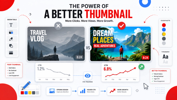
Most thumbnails with text fail for one reason: the words were designed at full canvas size and nobody checked whether they survive being shrunk to a 320-pixel feed tile. A bold headline that looks great at 1280×720 can become an unreadable gray smudge at thumbnail size — and an unreadable headline does double damage, because it wastes the space where a compelling message should be working for you. Readability comes down to three things: contrast between the text and the image behind it, the physical size of the letters after scaling, and how much visual noise competes with the words. The Thumbix Thumbnail Readability Checker measures all three. Upload your thumbnail, and the tool scores each text area for contrast and legibility at real feed dimensions, then tells you exactly what to fix.
How to use Thumbnail Readability Checker
Open the tool
Go to thumbix.site and open Thumbnail Readability Checker.
Upload your thumbnail
Drop a file or paste an image URL.
Review detected text
Confirm the tool found your headline lines.
Read the verdicts
Check contrast and size scores for each line.
Apply the fix
Change color, add a shadow, or enlarge the font.
Re-check and upload
Confirm every line passes, then publish.
What Is This Tool?
The Thumbnail Readability Checker analyzes the text regions of your thumbnail and scores them for contrast, size, and clarity at the small dimensions YouTube actually displays.
It simulates the scale-down your thumbnail will go through — desktop feed, mobile feed, and search — and reports a pass or fix-needed verdict for the text, so you never ship a headline viewers cannot read.
Why Use This Tool?
- Readable text is the fastest win for click-through rate — people click what they can read.
- Low contrast is the top mistake: light text on busy backgrounds disappears after scaling.
- A headline that is unreadable at thumbnail size is worse than no headline at all.
- You stop redesigning in the dark — the tool gives you a measurable verdict for every line.
- It works in your browser, so unpublished and branded designs never leave your device.
Who Should Use This Tool?
- Creators who add headline text to thumbnails and want it to survive every screen size.
- Editors who assemble thumbnails from templates and need a text-quality gate.
- Teams who manage channels and want consistent, legible branding across every video.
- Anyone designing reaction, tutorial, or news thumbnails that depend on a readable hook.
- Marketers testing headline copy and who want to verify legibility before they commit to it.
How Does It Work?
- It detects the text regions of your thumbnail automatically.
- It measures the contrast between each text area and the image behind it.
- It scales the letters down to real feed dimensions to estimate true legibility.
- It flags competing visual noise — busy backgrounds, overlapping elements, thin fonts.
- It returns a readable or needs-fix verdict for each line, with a suggested action.
What Makes Thumbnail Text Readable?
Three factors decide whether a viewer reads your headline in the fraction of a second they spend on your thumbnail. Contrast is the biggest: bold text in a color that stands out from the image behind it survives scaling, while similar tones blend together. Size matters next — letters that occupy a reasonable share of the frame at 1280×720 will still be readable at 320 pixels, while tiny captions simply vanish. Simplicity is third: a single short line beats three overlapping sentences every time, because viewers read one thought in a glance, not a paragraph.
A thumbnail headline has a quarter of a second to work. If it cannot be read in that quarter-second, it is decoration — not a message.
Real-World Use Cases
- The vanishing headline. A creator uses thin white text over a bright sky and the checker flags contrast so low it disappears at feed size.
- The tiny caption. A tutorial thumbnail crams three lines of text into the bottom corner — the checker scores it unreadable when scaled.
- The template upgrade. A team runs their standard template through the checker, adds a bold shadow, and every future thumbnail passes.
- The A/B test. A marketer tests two headline versions and uses the readability verdict to drop the weaker one before paying for impressions.
Step-by-Step Readability Check
- Step 1 — Upload your 1280×720 thumbnail to the checker.
- Step 2 — Confirm the detected text regions match your headline lines.
- Step 3 — Review the contrast score for each line.
- Step 4 — Check the scaled-size verdict for mobile and desktop feeds.
- Step 5 — Apply the suggested fix — darken the text, add a shadow, or enlarge the font.
- Step 6 — Re-check until every line passes, then upload.
Best Practices for Readable Thumbnail Text
- Keep headlines to five words or fewer — one idea per thumbnail.
- Use high-contrast colors, and add a drop shadow or outline when text sits on a busy image.
- Make text bold and large enough to read at 320 pixels wide — roughly a quarter of the frame height or more.
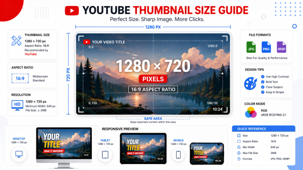
- Keep text inside the safe zone so the duration badge never covers a word.
- Never place text over faces — both the text and the face lose impact when they compete.
Edge Cases and Gotchas
- Gradient backgrounds can look high-contrast in one corner and low-contrast in another — test the whole headline area.
- Colored text on a color-matched background passes at full size but fails after scaling — always check at feed size.
- Hand-drawn or decorative fonts can pass a contrast test yet still be hard to parse — score legibility too.
- A readability pass does not mean a good message — the tool checks legibility, not whether the hook is compelling.
Interpreting the Result
- Every line passing means your text will survive mobile, desktop, and search placements.
- A needs-fix verdict with a low contrast score points to the color pairing — switch text or background.
- A needs-fix verdict with a size flag means the font is too small — enlarge it and shorten the line.
Frequently Paired Thumbix Workflows
Readability is the finishing check on a full thumbnail quality pipeline.
- Safe Zone Checker → Readability Checker. Fix placement first, then confirm the text is legible where it sits.
- Blur Checker → Readability Checker. Verify edges are sharp, then verify the message reads clearly.
- Readability Checker → CTR Goal Calculator. Pair legibility with the click-through math behind your thumbnail goals.
Conclusion
A thumbnail headline only earns its space when it can be read at the size your audience actually sees. The Thumbix Thumbnail Readability Checker scores contrast, size, and legibility at true feed dimensions, so every line of text you ship is doing real work. Pair it with the Safe Zone Checker for placement and the Blur Checker for sharpness, and your quality gate is complete.
Common Mistakes to Avoid
- Using thin or light-weight fonts that dissolve at feed size.
- Placing light text on bright, busy backgrounds with low contrast.
- Writing headlines of ten or more words that no one reads in a glance.
- Ignoring the scale-down — designing only at full canvas size.
- Putting text over faces, where it hurts both the message and the visual.
Frequently Asked Questions
It measures the contrast between each text region and the background, simulates the scale-down to feed sizes, and returns a per-line verdict.
Scaling a 1280×720 canvas down to a 320-pixel tile shrinks letters dramatically, and low contrast or thin fonts that survive at full size can become unreadable.
Strong, high-contrast pairings — dark text on light backgrounds or bright text on dark ones — are the safest; the checker flags pairings that fall below a readable threshold.
Large enough to read at 320 pixels wide — headlines that occupy roughly a quarter of the frame height or more tend to hold up at feed size.
Yes — and because it runs in your browser, unpublished and branded designs never leave your device.
It checks legibility — contrast, size, and clarity. Whether the hook is compelling is still your job.
Text and faces compete for attention — both lose impact when they overlap.
Switch to a darker or lighter text color, add a drop shadow or outline, or simplify the background behind the text.
Yes, completely free with no account or sign-up required.
Yes — the contrast and legibility analysis applies to any image, though Shorts cover art follows its own layout rules.
Yes — run each version through the checker and pick the layout that passes at every feed size.
No — but unreadable text almost guarantees fewer. Readability is a necessary baseline for a working thumbnail.
Make every headline readable at feed size
Upload your thumbnail, get a contrast and legibility verdict for each line, and apply the fix before you publish — free and completely private.
Try the Thumbnail Readability Checker