Table of Contents
- The Correct YouTube Profile Picture Size
- Why the Source Image Is Square but Displays as a Circle
- Understanding the Safe Area
- File Formats and Size Limits
- Where Your Profile Picture Appears
- Personal Creators vs. Businesses
- Logos vs. Portraits: Which Works Better
- Background, Contrast, and Typography Choices
- Common Design Mistakes to Avoid
- Resizing and Cropping Without Losing Quality
- Staying Recognizable at Small Sizes
- How Often Should You Change Your Profile Picture
- Practical Design Checklist
- Frequently Asked Questions
- Conclusion
Get YouTube profile picture size right the first time: exact dimensions, circular cropping rules, safe-zone design tips, and mistakes to avoid so your avatar stays sharp everywhere.
The Correct YouTube Profile Picture Size
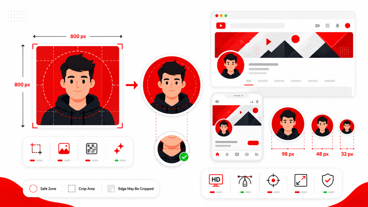
The recommended YouTube profile picture size is 800 x 800 pixels, uploaded as a square image. YouTube accepts smaller images, but anything below roughly 98 x 98 pixels won't upload, and low-resolution images tend to look soft or pixelated once displayed at larger sizes across the platform. Starting with a full 800 x 800 square canvas gives you the best chance of a crisp, professional-looking avatar across every device and surface. This size matters because your profile picture appears in dozens of places — next to comments, in subscription feeds, on your channel page, in search suggestions, and inside the YouTube app's navigation — often at very different physical sizes. A properly sized source image scales down cleanly; an undersized one does not.
Why the Source Image Is Square but Displays as a Circle
One of the most common points of confusion is that YouTube asks for a square image but displays it as a circle almost everywhere on the platform. This is intentional: YouTube standardizes on a square upload for consistency and flexibility, then applies a circular mask when rendering it in the interface. The practical effect is that the four corners of your square image are cropped away. Anything positioned near the corners — a logo edge, part of a face, or important text — will be cut off in the final circular display, even though it's visible in the original square file.
Understanding the Safe Area
Because of this circular crop, designers work within what's often called a "safe area" — roughly the inner circle of the square canvas, centered and slightly inset from the edges. Anything critical to your branding, such as a face, logo mark, or key graphic element, should sit comfortably inside this zone. A simple way to visualize it: imagine a circle inscribed inside your square canvas, touching the middle of each edge. Everything outside that circle may be invisible depending on where YouTube displays your avatar. Keeping essential content centered protects your design regardless of exactly how tightly the crop is applied on a given surface.
File Formats and Size Limits
YouTube profile pictures typically accept standard image formats including JPG, PNG, BMP, and GIF (static, non-animated). Keep the file size reasonable — well under a few megabytes — since oversized files can slow uploads or trigger format warnings. There's no benefit to uploading an extremely large file beyond 800 x 800 pixels; YouTube will not display additional detail beyond what the interface actually renders at. If your design software exports at a much larger size, such as 2000 x 2000 pixels, resize it down to 800 x 800 before uploading rather than relying on YouTube to do the scaling for you. This keeps compression predictable and avoids unnecessary quality loss during upload.
Where Your Profile Picture Appears
A YouTube avatar shows up in more places than most creators initially realize:
- Next to your channel name on your channel page and banner
- Beside every comment you post
- In subscription feeds and notification bells
- In search results next to your channel name
- Inside the YouTube mobile app's navigation and account menu
- On community posts, live chat, and Shorts
- In embedded video players on external websites, next to the channel name
Because it appears at wildly different sizes — from a tiny 24-pixel icon in a notification to a larger image on your channel page — the design needs to hold up at both extremes. This is a major reason simplicity and centered composition matter more for an avatar than for almost any other piece of channel branding.
Personal Creators vs. Businesses
The right approach to an avatar often differs based on channel type. Personal creators frequently use a clear, well-lit headshot or a simplified illustrated version of themselves. A recognizable face builds a personal connection with viewers and helps the channel feel approachable, especially for vlogs, commentary, or creator-led content. Businesses and brands more often use a logo mark rather than a person's face, particularly if the channel represents a company rather than an individual creator. A simplified, icon-style version of the logo — rather than a full lockup with text — tends to translate better into a small circular space. Neither approach is universally correct; the right choice depends on whether viewers are subscribing to a person or a brand.
Logos vs. Portraits: Which Works Better
Full logos with text rarely work well as profile pictures because text becomes unreadable once scaled down to icon size. If your brand identity relies on a wordmark, consider isolating just the icon or symbol portion of the logo for the avatar, and let the full logo live elsewhere, such as your channel banner. Portraits generally perform better when the face is centered, well-lit, and shot with reasonable contrast against the background. Extreme close-ups can look distorted once cropped circularly, while photos taken from too far away lose detail at small sizes. A head-and-shoulders composition, centered in the frame, tends to hold up best.
Background, Contrast, and Typography Choices
- Backgrounds should be simple and not visually competing with the subject. Busy or highly detailed backgrounds tend to muddy the image at small sizes.
- Contrast matters more than color choice. A subject or logo with strong contrast against its background stays legible even in a tiny circular icon, while low-contrast combinations blend together and become hard to identify.
- Typography should generally be avoided altogether in an avatar. Any text becomes unreadable well before the image reaches its smallest display size, and unreadable text just adds visual noise.
Common Design Mistakes to Avoid
- Uploading a rectangular image and letting YouTube crop it unpredictably instead of designing on a proper square canvas.
- Placing a logo or face too close to the corners, where it gets clipped by the circular mask.
- Using a low-resolution image that looks fine at full size but pixelates once scaled down.
- Including small text that's illegible even at moderate sizes.
- Choosing a background that's nearly the same color as the subject, reducing contrast and legibility.
- Changing the avatar frequently enough that regular viewers have trouble recognizing the channel.
Resizing and Cropping Without Losing Quality
When resizing an existing image down to 800 x 800 pixels, start from the highest-resolution version available rather than repeatedly resizing a smaller file, which compounds quality loss. Crop to a perfect square first, keeping the subject centered, then resize the square crop to the target dimensions using an image editor that preserves sharpness during downscaling. Avoid stretching a non-square image to fit a square canvas, since this distorts proportions. It's better to crop content out than to warp the image.
Staying Recognizable at Small Sizes
Since your avatar is frequently viewed at very small sizes, test the design by shrinking it down to roughly the size of a typical notification icon and checking whether it's still clearly identifiable. If details disappear or the subject becomes ambiguous at that size, simplify the composition — reduce fine detail, increase contrast, and keep the subject centered and large within the frame.
How Often Should You Change Your Profile Picture
There's no fixed rule, but frequent changes can make it harder for regular viewers to recognize your channel at a glance across subscription feeds and comment sections. Many established creators keep the same avatar for long stretches of time, adjusting only for major rebrands, milestones, or channel repositioning. If you do update it, keep the overall composition style (framing, color palette, contrast level) reasonably consistent so returning viewers still recognize the channel.
Examples of Good and Bad Avatar Design Concepts
Good example concept: A centered, well-lit headshot with a simple, muted single-color background, filling most of the frame without touching the very edges. The subject's eyes sit roughly in the upper-middle third of the square, leaving balanced space below, so nothing important lands near the corners that get clipped by the circular crop. Bad example concept: The same photo, but taken from further back so the subject is small in the frame with a cluttered background filling most of the canvas. At icon size, the subject becomes an indistinct blur against a busy backdrop, and any detail that made the photo recognizable at full size disappears entirely. Good logo example concept: A single simplified icon mark, centered, with generous padding on all sides so no element touches the edge of the square canvas. Bad logo example concept: A full horizontal logo lockup with a wordmark crammed into the square canvas, forcing the text to shrink to the point of illegibility once displayed as a small circular icon. The pattern across all four examples is consistent: simplicity, centering, and generous padding around the subject consistently outperform detail-heavy or edge-to-edge compositions once an image is scaled down to icon size.
Practical Design Checklist
- Design on an 800 x 800 pixel square canvas.
- Keep the subject or logo centered and within the circular safe area.
- Avoid placing anything critical near the corners.
- Use a simple, non-competing background.
- Prioritize contrast over decorative detail.
- Avoid embedding text in the image.
- Export as JPG or PNG at full resolution, without unnecessary compression.
- Preview the design at a small icon size before finalizing.
Testing Your Avatar Alongside Your Other Channel Branding
A profile picture rarely stands alone — it's seen alongside your banner, your thumbnails, and your channel name in most contexts. Before finalizing a new avatar, it's worth placing a mockup of it next to your current banner and a couple of recent thumbnails to check that the color palette and overall style feel cohesive rather than mismatched. A jarring contrast between a colorful, playful avatar and a minimal, muted banner can make a channel feel visually inconsistent, even if each individual asset looks fine on its own. This kind of side-by-side check takes only a few minutes but often reveals issues that are hard to spot when reviewing the avatar in isolation. It's also useful to view your avatar mockup at the various sizes it will actually appear at — full size on your channel page, medium size in search results, and small size in a comment thread — rather than only judging it at one fixed size in your design software.
Conclusion
Getting your YouTube profile picture size right comes down to a few consistent rules: start with an 800 x 800 pixel square canvas, keep essential content inside the circular safe area, prioritize contrast and simplicity over fine detail, and avoid embedding text. A well-designed avatar stays recognizable whether it's shown as a tiny notification icon or displayed larger on your channel page, which is exactly what strong channel branding depends on.
Frequently Asked Questions
What is the ideal YouTube profile picture size?
800 x 800 pixels, uploaded as a square JPG, PNG, BMP, or static GIF file.
Why does YouTube crop my square image into a circle?
YouTube standardizes uploads as squares for consistency, then applies a circular mask across the interface. Content near the corners of your square image gets cropped away in the final display.
What happens if my image isn't square?
YouTube will generally crop it into a square before applying the circular mask, which can cut off parts of the image unpredictably. Crop to a square yourself before uploading for full control.
Can I use a full logo with text as my avatar?
It's not recommended, since text becomes illegible at small display sizes. Use just the icon or symbol portion of your logo instead.
Does a higher-resolution image look better on YouTube?
Up to 800 x 800 pixels, yes. Beyond that, extra resolution provides no visible benefit since the interface won't render it any larger.
How do I know if my avatar will look good at small sizes?
Shrink a preview to roughly icon size (32–48 pixels) and check whether it's still clearly identifiable. Simplify the design if details disappear.
Should personal creators use a photo or a logo?
Personal, creator-led channels usually benefit from a clear photo, while business or brand channels tend to work better with a simplified logo mark.