Table of Contents
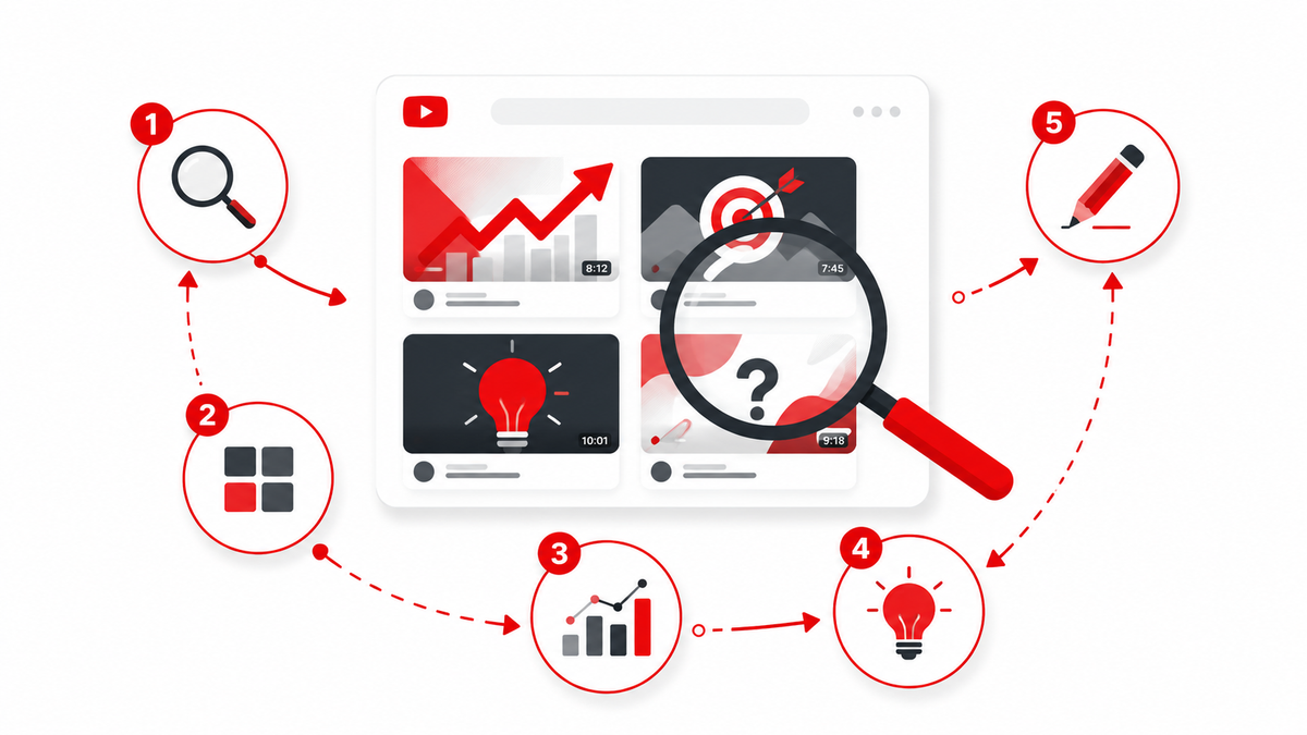
- Step 1: Find the Right Competitors
- Step 2: Build a Thumbnail Sample
- Step 3: Analyze the Visual Patterns
- Step 4: Identify What You Can Learn
- Step 5: Create a Better, Original Thumbnail
- Competitor Research Is Not the Same as Copying
- Tools for Collecting and Organizing Research
- Common Mistakes in Competitor Thumbnail Research
- Competitor Thumbnail Research Worksheet
- Frequently Asked Questions
A 5-step framework for studying competitor YouTube thumbnails and turning patterns into original, better-performing designs.
Your last three thumbnails underperformed and you don't know why. Meanwhile, three other channels in your niche seem to nail it every single time. The instinct is to open their channel, stare at a thumbnail you like, and try to recreate it. That approach rarely works, because you're copying a single result without understanding the pattern behind it. Competitor thumbnail research is the discipline of studying many examples systematically, so you walk away with reusable design principles instead of one imitation that may not even suit your content.
This guide breaks the process into five steps: finding the right competitors, building a sample large enough to spot real patterns, analyzing the visual details that actually matter, separating genuine insight from coincidence, and turning what you've learned into an original thumbnail. There's also a worksheet you can copy into a spreadsheet to keep the process organized instead of scattered across open browser tabs.
Step 1: Find the Right Competitors
Not every channel with a bigger subscriber count is a useful competitor. A creator with two million subscribers who covers a completely different sub-topic, uploads on a different schedule, or built their audience years ago under different platform conditions won't tell you much about what works for your videos today. Useful competitors share your audience, your topic, or your format.
Direct competitors cover the same specific topic for a similar audience. If you make budget travel guides for Southeast Asia, a channel doing the same thing is a direct competitor, regardless of size.
Adjacent competitors target the same viewer but from a different angle. A personal finance channel and a minimalism channel might both be competing for the attention of the same 25-to-35-year-old audience even though the subject matter differs.
Format competitors use a similar video style, such as tutorials, vlogs, or reaction content, which often share thumbnail conventions regardless of niche.
Instead of relying on subscriber count alone, use these sources to build your list:
- YouTube Search: search your core topics and note which thumbnails appear repeatedly on page one.
- Suggested Videos: watch a few videos in your niche and record what YouTube recommends next to them.
- Home feed: check what a fresh or logged-out session surfaces for your topic, since this reflects broader demand.
- Related channels: many channel pages surface similar creators, which is a fast way to expand your list.
Aim for 8 to 15 competitor channels of varying sizes: a few larger channels for aspirational patterns, a few similarly sized channels for realistic comparisons, and a few smaller, fast-growing channels that may be testing newer approaches successfully.
It also helps to separate "who you compete with for views" from "who you compete with for subscribers." A channel might rank for the same search terms as you without targeting the same long-term audience, and vice versa. Both types of competitors are worth studying, but for slightly different reasons: search competitors show you what convinces someone mid-search to click, while audience competitors show you what keeps a similar viewer subscribed over time.
Step 2: Build a Thumbnail Sample
A single viral thumbnail tells you almost nothing, because outlier videos are often driven by factors outside the thumbnail itself, such as a trending topic, a collaboration, or an algorithm push. Patterns only become visible across a larger sample.
For each competitor, collect:
- Their 10 to 15 most recent uploads, to see current, active habits.
- Their 5 to 10 highest-viewed videos of the last 6 to 12 months, to see what has actually resonated with viewers.
- At least three different video topics per channel, since a channel's thumbnail approach can change depending on subject matter (a tutorial thumbnail often looks different from a personal-story thumbnail on the same channel).
Across 10 competitors, that gives you a working sample of 100 to 150 thumbnails, which is enough to notice real repetition rather than one-off design choices. Save screenshots into folders organized by channel, and keep the video title and view count alongside each image so you can connect visual choices back to performance later.
Step 3: Analyze the Visual Patterns
This is where most creators either rush through or get overwhelmed. A structured checklist keeps the analysis manageable. For each thumbnail, note what you observe in these categories:
- Color: dominant colors, contrast between subject and background, whether colors are saturated or muted, and whether a consistent palette is used across the channel.
- Composition: where the main subject sits (left, right, center), how much of the frame it occupies, and whether the layout follows a rule-of-thirds style grid or something more asymmetric.
- Faces and expression: whether a face is present, its size relative to the frame, and the emotion being conveyed (shock, curiosity, joy, concern).
- Text and typography: word count, font weight, use of outlines or drop shadows for legibility, and whether the text restates the title or adds new information.
- Backgrounds: blurred versus sharp, real photography versus graphics, and how much visual "noise" competes with the subject.
- Graphic elements: arrows, circles, boxes, numbers, or icons used to direct attention or signal a list/ranking format.
- Cropping and framing: tight close-ups versus wide shots, and how the subject is cropped at the edges.
- Visual hierarchy: what your eye lands on first, second, and third, and whether that order matches what the video is actually about.
- Negative space: how much of the frame is left deliberately empty to let the main element breathe.
- Branding: consistent logos, color bars, or frame treatments used across every upload on a channel.
Record these observations in a spreadsheet rather than relying on memory. A simple rating scale (present/absent, or low/medium/high for elements like contrast) is enough to reveal patterns once you compare rows across many thumbnails.
Step 4: Identify What You Can Learn
Once you have data across many thumbnails, look for what repeats rather than what looks impressive in isolation. A pattern that shows up on 8 of 10 channels in your niche is worth taking seriously. A single striking thumbnail from one video is closer to an anecdote.
Be careful about correlation versus causation. A high-performing video with a red thumbnail doesn't mean red causes clicks; it may be that the topic itself was in demand, the title did the heavy lifting, or the channel's existing audience would have clicked regardless of the image. Cross-check any pattern against multiple channels and multiple time periods before treating it as a real convention.
Useful things to look for at this stage include:
- Topic-specific conventions: certain formats (versus/comparison videos, "top 10" lists, tutorials) tend to reuse specific visual shorthand, like split-screen layouts or numbered badges.
- Audience expectations: viewers in some niches expect a face and clear emotion; in others (software tutorials, for example) a clean screenshot with minimal text performs consistently well.
- The title-thumbnail relationship: check whether the thumbnail repeats the title's main word, contradicts it for curiosity, or adds a detail the title leaves out. This interplay is often more important than either element alone.
- Information density: whether successful thumbnails in your niche say one thing clearly or several things at once, and how that matches your own content style.
- Simplicity versus complexity: some niches reward a bold, single-subject image; others (gaming, especially) tolerate busier compositions with several elements.
Step 5: Create a Better, Original Thumbnail
The goal of all this research is a concept you can call your own, not a redesign of someone else's thumbnail with your face swapped in. There's a meaningful difference between:
- Borrowing a concept, such as "this niche responds well to a clear before/after visual," which is a design principle you can apply in your own way.
- Copying an execution, such as recreating someone's exact layout, font, color combination, and pose, which crosses into imitation and risks looking derivative to viewers who follow both channels.
Practical ways to translate research into an original design:
- Write down the pattern in words first ("high-contrast subject on left third, single bold word on right, warm color background") before opening your design tool. This forces you to internalize the principle rather than trace the image.
- Build your own composition using your own photography, your own face, and your own color choices, applying the pattern rather than the specific pixels.
- Design a visual hook unique to your video's actual content, not a generic "shocked face" that could apply to any topic.
- Create two or three variations and, where your channel size allows it, test them using YouTube Studio's thumbnail testing feature or by simply tracking click-through rate after publishing.
- Feed results back into your research spreadsheet so your own data becomes part of future decisions, not just competitor data.
Competitor Research Is Not the Same as Copying
It's worth being explicit about the line between inspiration and infringement, because this comes up often in creator communities. Studying widely used conventions, like a numbered list format or a common color scheme in a niche, is standard creative practice and not something anyone owns. Recreating someone's specific photograph, illustration, exact layout, and text treatment is a different matter, and depending on the situation and jurisdiction, could raise copyright or trademark concerns, particularly if you use another creator's actual image assets or closely mimic a design so distinctive it functions as their visual signature.
This isn't legal advice, and copyright and trademark rules vary by country. If you're ever unsure whether a specific design choice is safe to use, the safer path is to build your own asset from scratch rather than editing or closely tracing someone else's.
Tools for Collecting and Organizing Research
You don't need specialized software to run this process well. A simple setup works:
- A spreadsheet (Google Sheets or Excel) for the worksheet described below, one row per thumbnail.
- A screenshot tool or your browser's built-in save-image function to capture thumbnails at their native resolution rather than a compressed preview.
- Folders organized by channel or by niche topic, so you can flip through a single channel's history quickly or compare how different channels handle the same topic.
- A thumbnail downloader, such as Thumbix, when you want to grab a specific competitor's thumbnail at its highest available resolution for closer visual inspection, rather than working from a small, compressed preview image.
Keeping research organized matters more than the tools themselves. A messy folder of 200 unlabeled screenshots is far less useful than 60 thumbnails logged with their channel, topic, and view count, because the labeled version lets you actually cross-reference patterns later.
Common Mistakes in Competitor Thumbnail Research
Studying only viral outliers. A single thumbnail that got 10 million views might owe its performance to a trending topic or a lucky algorithm push, not the design itself. Weight your analysis toward channels with consistent performance across many videos, not one lucky hit.
Ignoring the title entirely. Thumbnails don't work in isolation. A pattern that looks strange on its own (like a thumbnail with almost no information) often makes sense once you see it paired with a title that supplies the missing context.
Copying instead of translating. As covered above, recreating someone's exact layout and assets is different from applying the underlying principle. If your finished thumbnail could be mistaken for a slightly edited version of a specific competitor's image, you've gone too far.
Analyzing too small a sample. Five thumbnails from two channels won't reveal reliable patterns. Aim for the ranges suggested in Step 2, even if it takes an extra hour of research time.
Never revisiting the research. Niches evolve. A convention that dominated a year ago may have faded as more creators adopted it and audiences grew numb to it. Treat competitor research as an ongoing habit, not a one-time project.
Competitor Thumbnail Research Worksheet
Use a table like this in a spreadsheet to keep your findings organized and comparable across channels.
| Channel | Video Topic | Thumbnail Style | Main Subject | Text Amount | Colors | Composition | Emotional Hook | Title Relationship | What Works | What to Improve | Idea to Test |
|---|---|---|---|---|---|---|---|---|---|---|---|
| Example Channel A | Budget travel gear review | Bold subject + 3-word text | Presenter holding product | Low (3-4 words) | High contrast, orange/blue | Subject left, text right | Curiosity | Text adds detail title omits | Clear focal point | Background slightly busy | Try plain background version |
| Example Channel B | Tutorial walkthrough | Screenshot + arrow overlay | Software UI | Medium | Neutral, one accent color | Centered UI, arrow top-right | Clarity, not emotion | Text restates title keyword | Instantly readable | Feels generic vs competitors | Add before/after split |
Fill in real rows for each competitor and topic you study. Over time, this worksheet becomes a reference you can return to before designing every new thumbnail, rather than starting from a blank canvas each time.
Frequently Asked Questions
How many competitor channels should I analyze?
Somewhere between 8 and 15 gives you enough variety to spot real patterns without the research becoming unmanageable. Include a mix of channel sizes rather than only the biggest names in your niche.
Is it okay to get inspired by a competitor's thumbnail?
Yes. Studying widely used visual conventions and adapting general principles, such as composition or color contrast, is standard practice. The concern arises when you closely recreate someone's specific image, layout, or distinctive visual signature rather than applying a general idea in your own way.
How often should I redo competitor research?
Revisit it every few months, or whenever you notice your click-through rate declining. Niche conventions shift as more creators experiment, and audience expectations shift with them.
Should I only study channels larger than mine?
No. Smaller, fast-growing channels are often testing newer approaches and can reveal emerging patterns before they become common. A mix of larger and comparable-sized channels gives a more complete picture.
What if my niche doesn't have many faces in thumbnails?
Some niches, like software tutorials or data-heavy content, rely more on screenshots, diagrams, or clean typography than on faces. Follow what actually repeats in your specific niche rather than assuming every thumbnail needs a face.
How do I know if a pattern I noticed is real or a coincidence?
Check it against multiple channels and multiple time periods. If the same visual choice shows up consistently across many creators and many videos, it's more likely a genuine convention than a one-off result driven by an unrelated factor like a trending topic.
Can competitor research replace testing my own thumbnails?
No. Research narrows down promising directions, but only your own audience's response confirms what actually works for your channel. Use research to generate ideas worth testing, not as a substitute for testing itself.